PERSONAL PROJECTS: Urban Environment
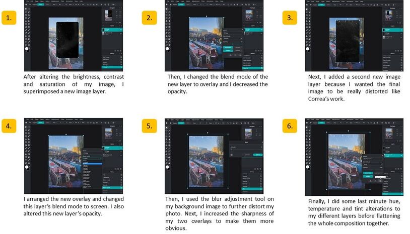
|
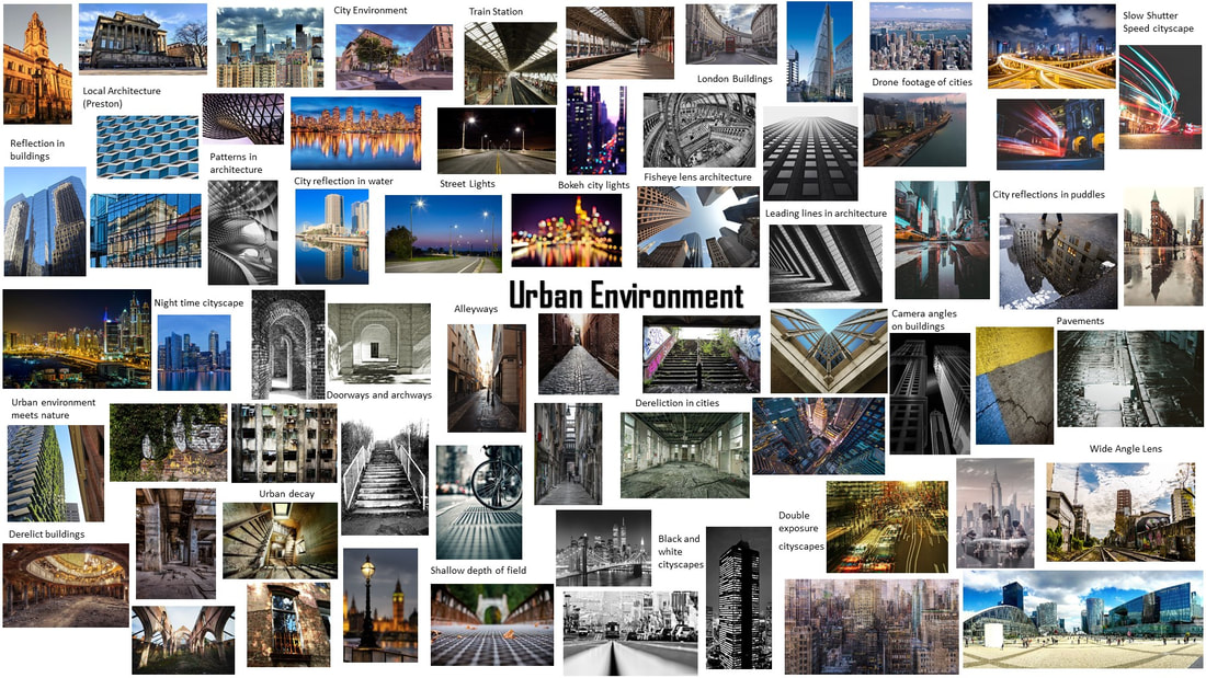
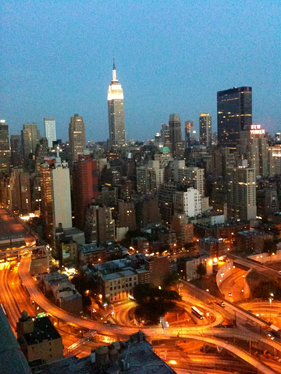
An urban area is the region surrounding a city. Most inhabitants of urban areas have nonagricultural jobs. Urban areas are very developed, meaning there is a density of human structures such as houses, commercial buildings, roads, bridges, and railways. An "urban area" can refer to towns, cities, and suburbs.
|
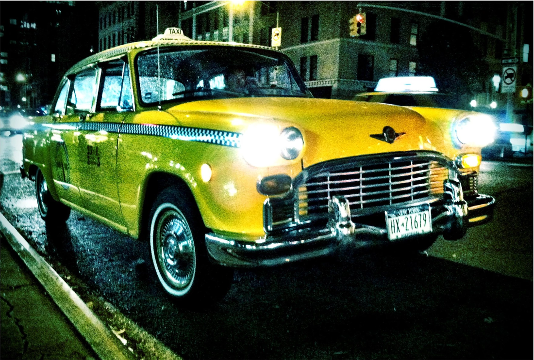
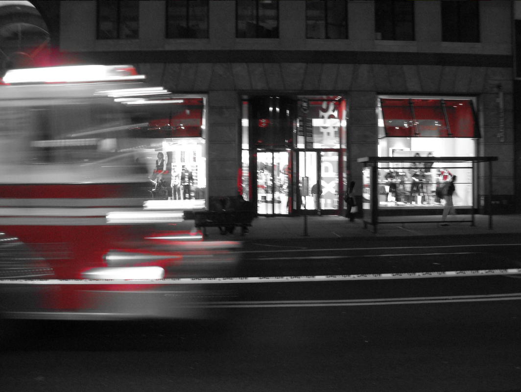
There's an aesthetic theme, which is cities at two o'clock in the morning. Not cities packed with people going out to clubs and dancing but desolate, empty streets. It's off-putting but there's a strange comfort to it as well, that desolate urban environment. The city is not a concrete jungle, it is a human zoo. |
Initial Research
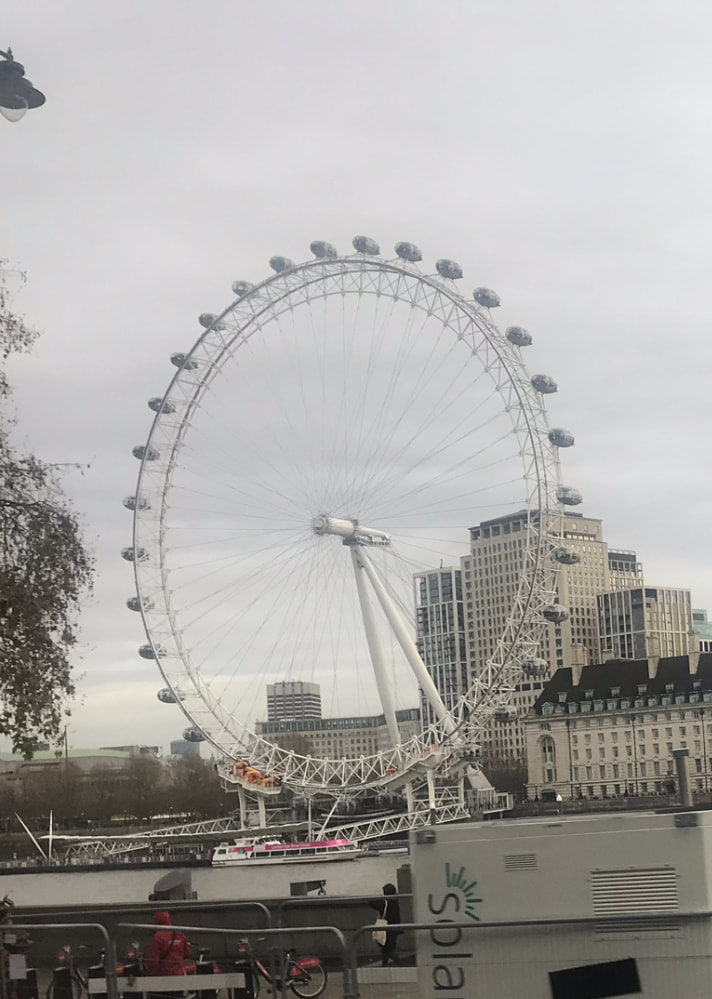
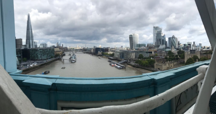
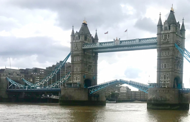
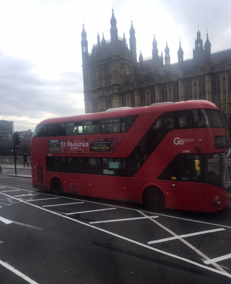
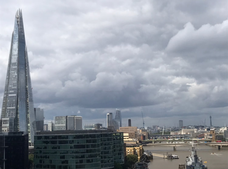
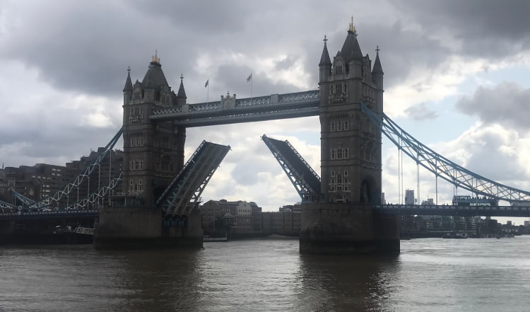
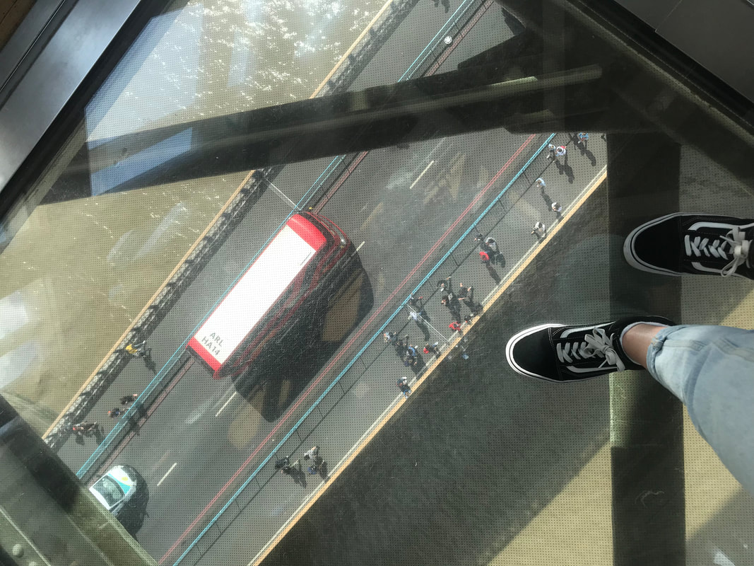
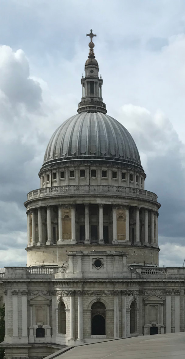
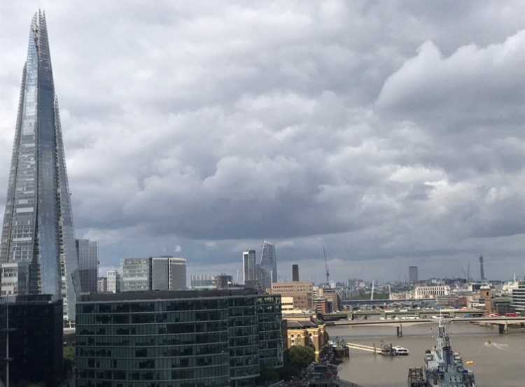
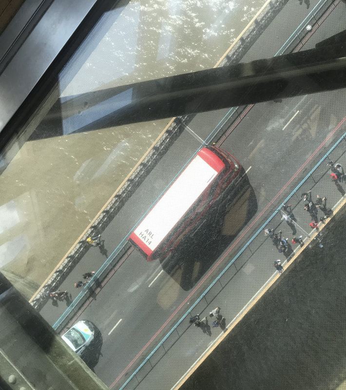
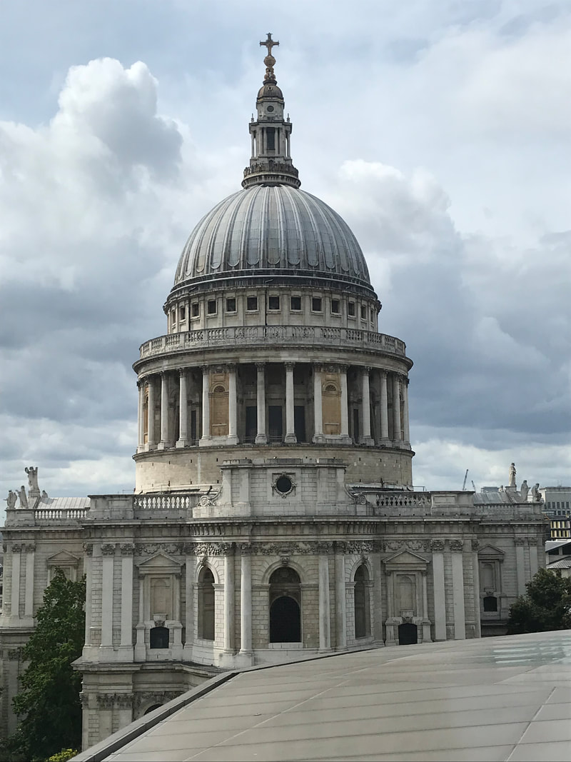
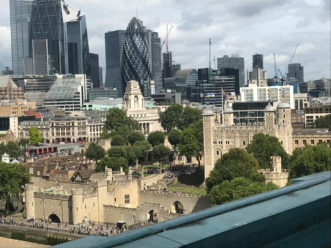
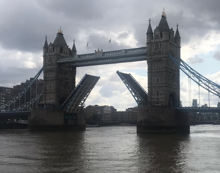
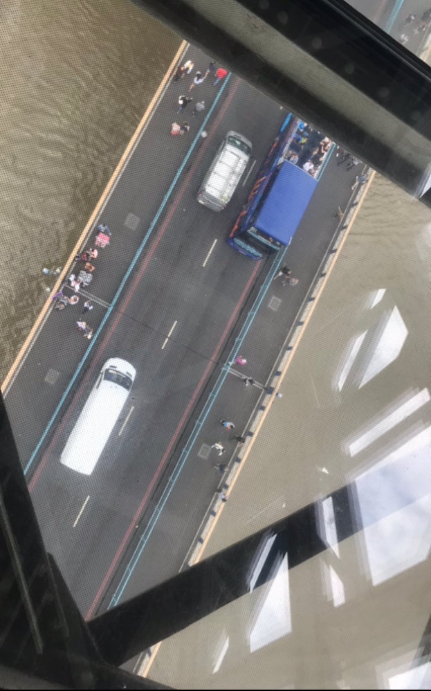
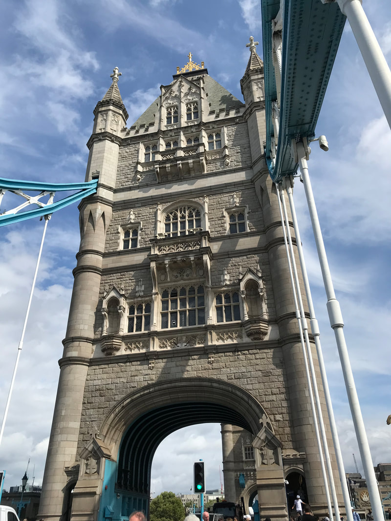
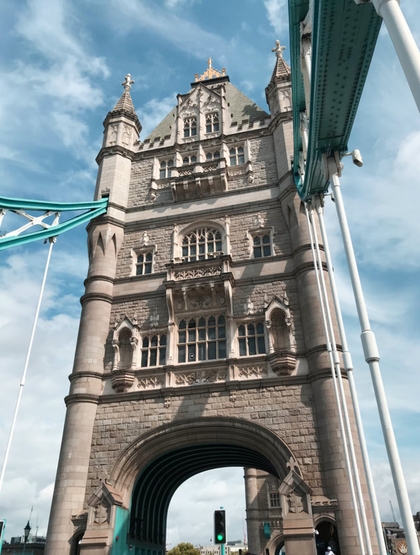
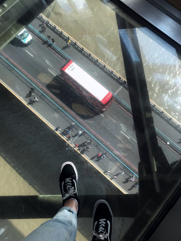
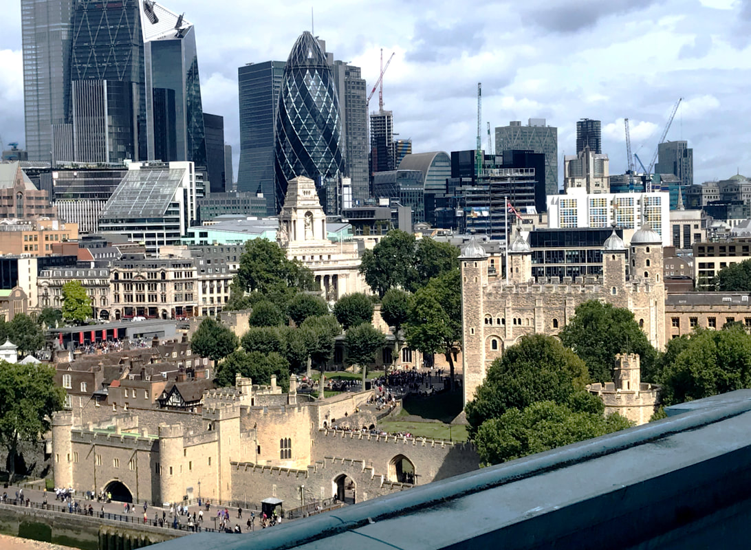
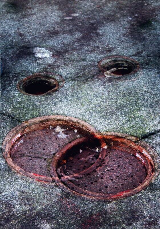
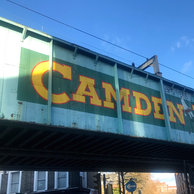
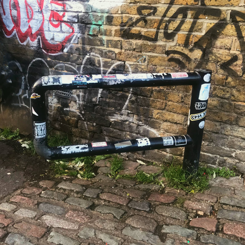
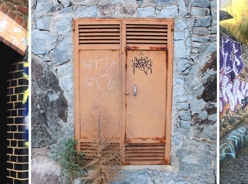
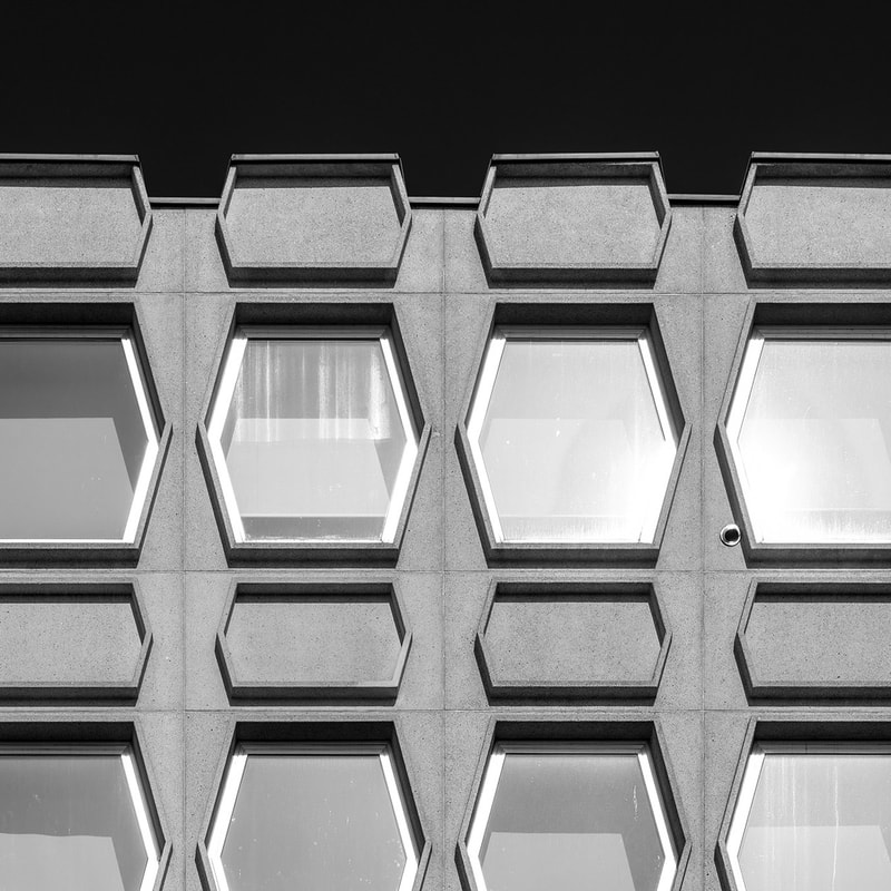
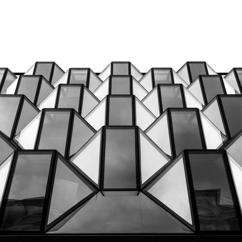
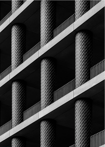
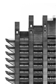
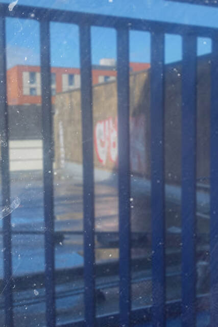
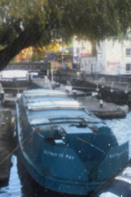
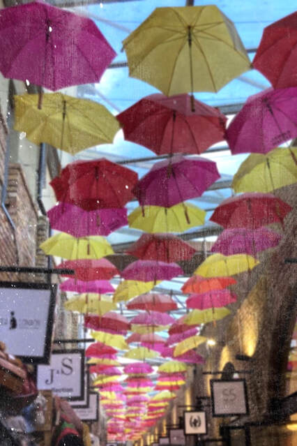
My Initial Urban Environment Investigation / London
Recently, I visited London and I was inspired by the contrast of old and modern architecture. Below are some photographs I took whilst visiting the city; I tried to experiment with different techniques such as a wide angle lens and using different vantage points.
Edited Images:
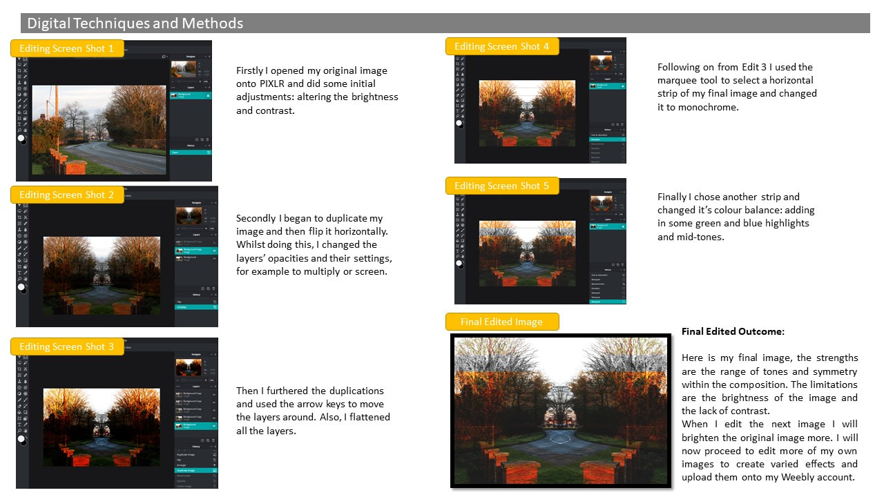
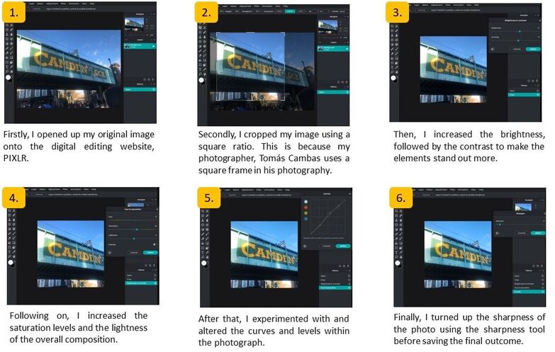
Using PIXLR, I applied the smoothness and glamour effects because I felt the image was too sharp and high in contrast.
|
When digitally editing this image, I decreased the exposure, rotated and changed the hue to create a polished final image.
|
Original edit
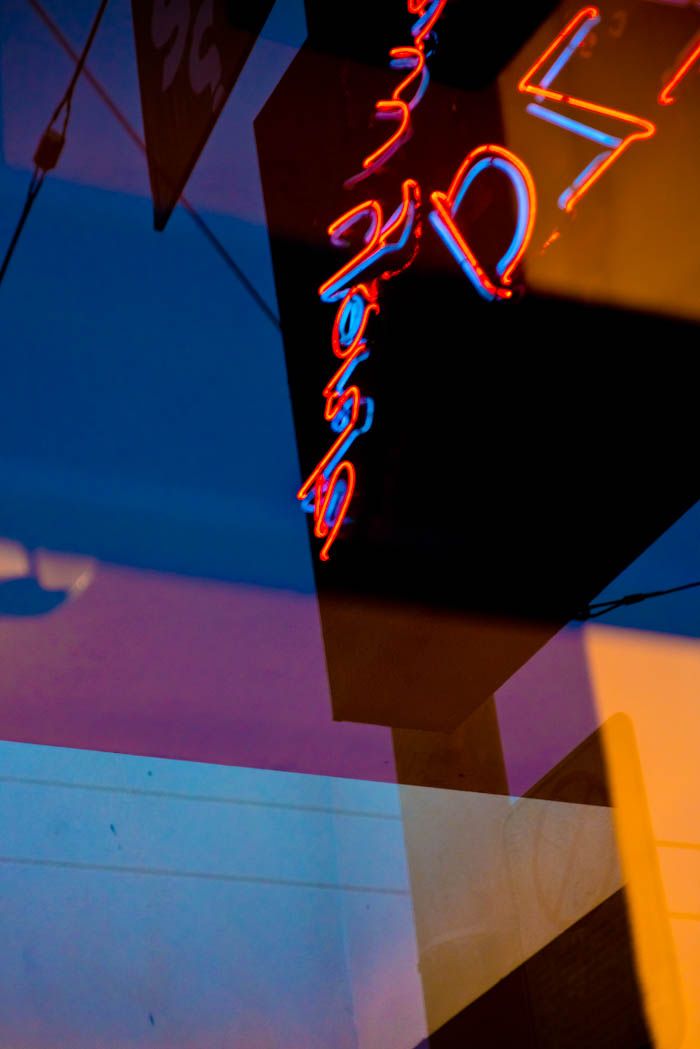
I created the multi-layered edit on PIXLR by duplicating the original image, changing the blend mode to multiply and then flipping the new layer horizontally. I then duplicated the layer again and changed the blend mode to overlay. Before finishing, I altered the hue and lightness of the flattened product.
|

Multi-layered edit
|
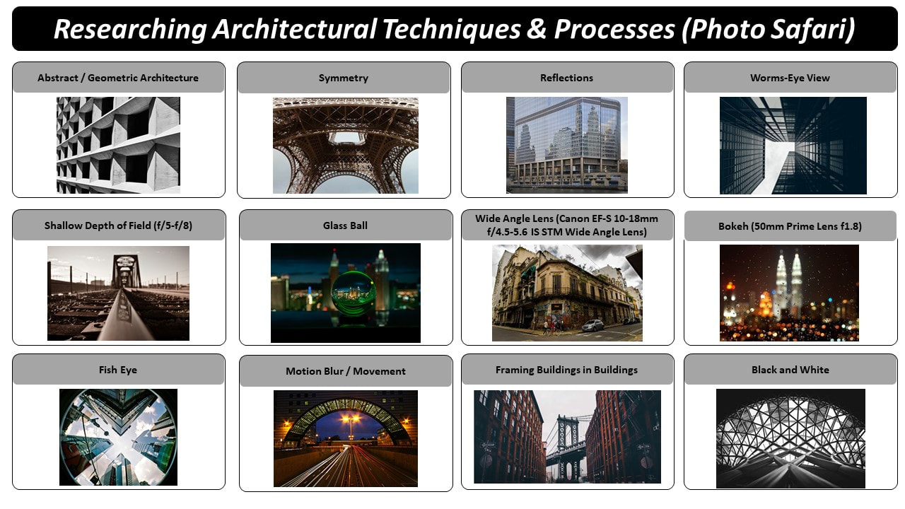
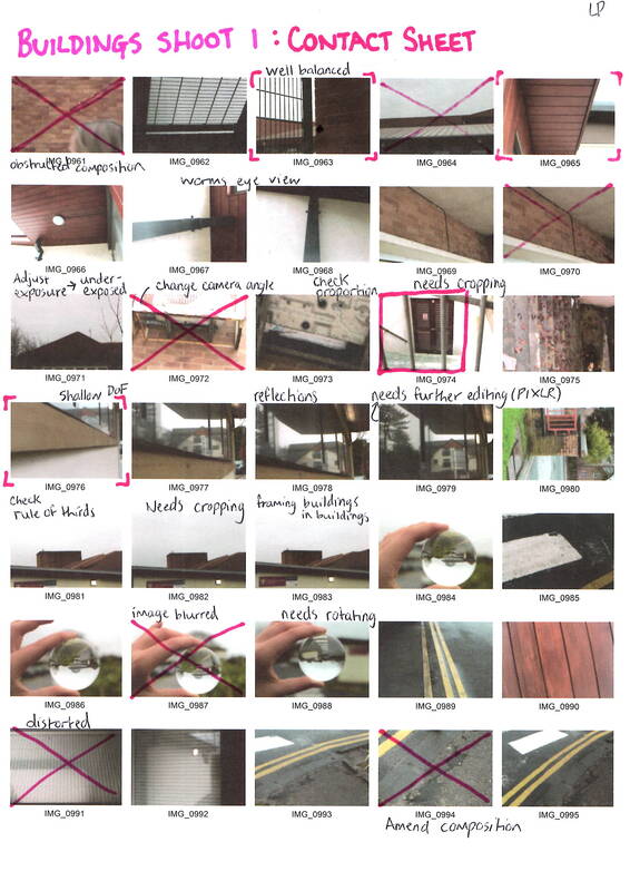
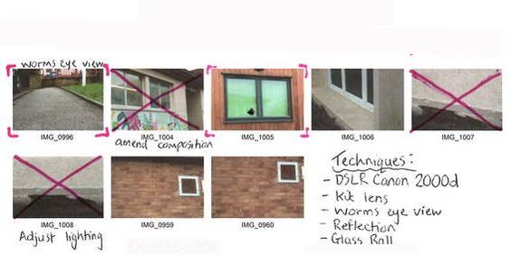
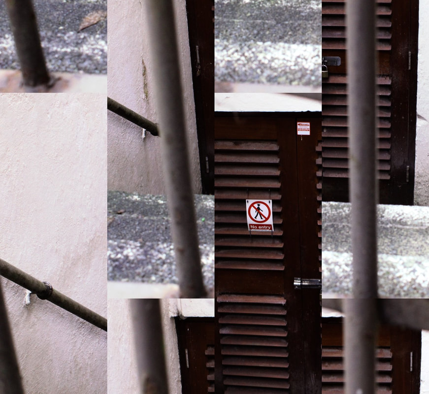
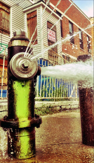
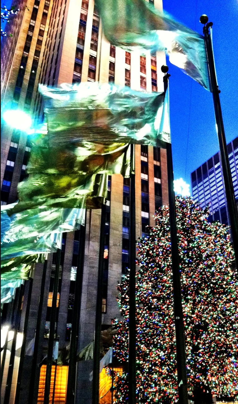
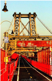
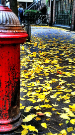
Urban Environment Photo Safari
|
|
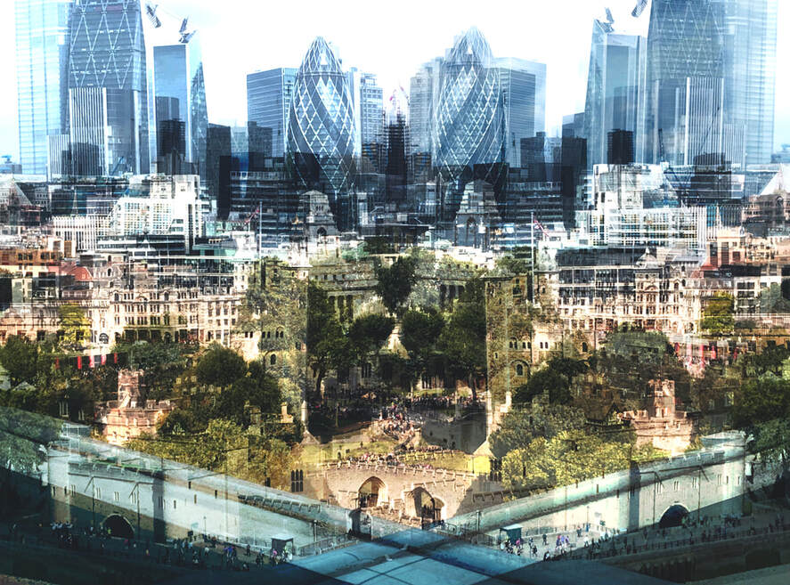
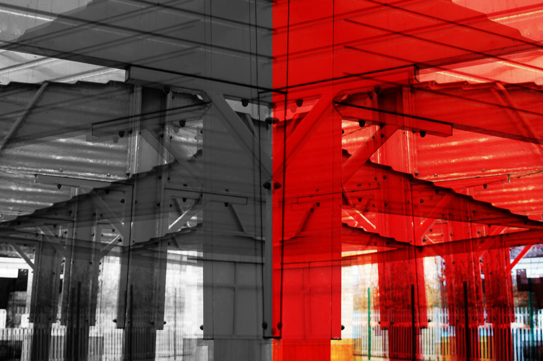
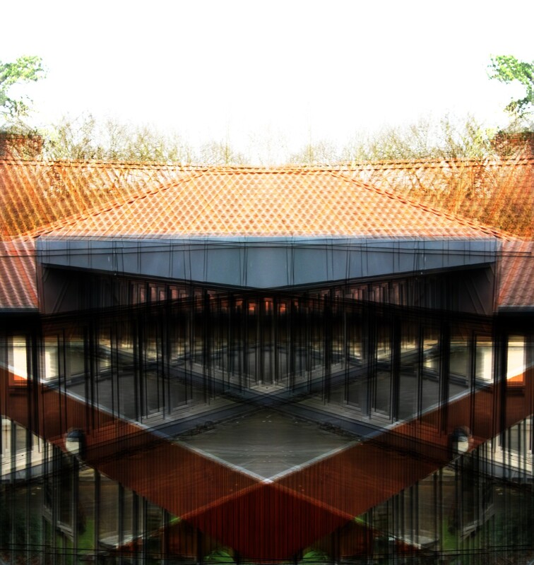
Digital Editing
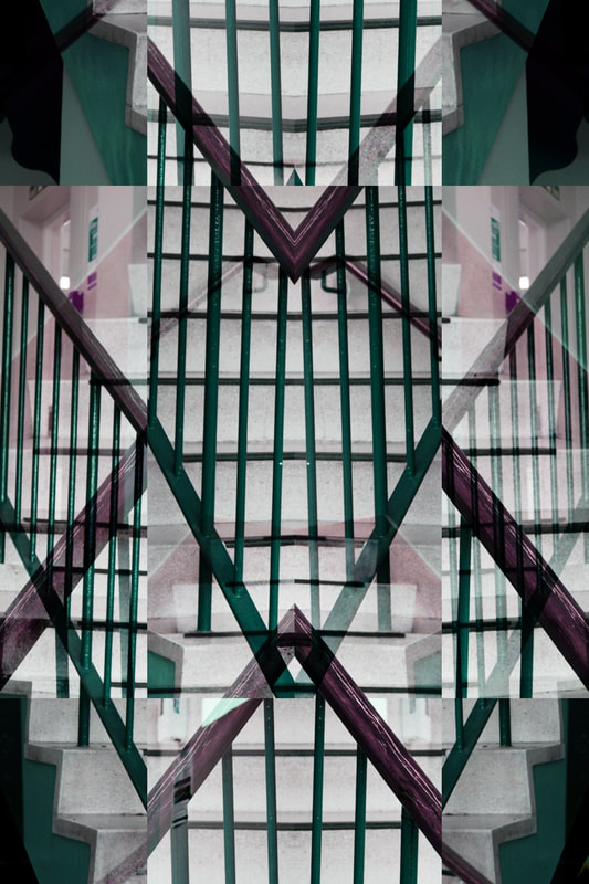
Multi-layered images:
|
|
|
|
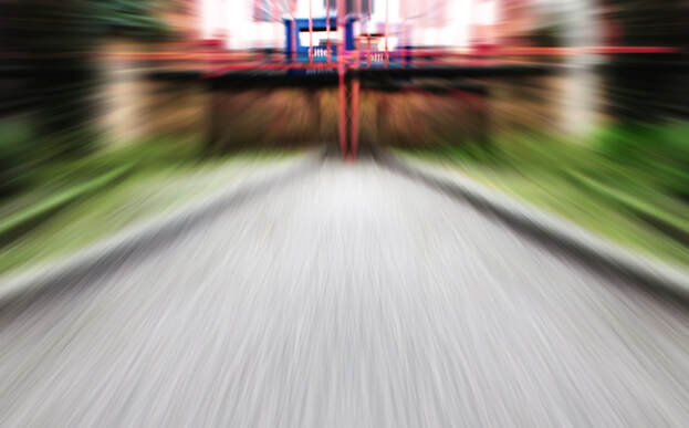
Zoom blur:
|
|
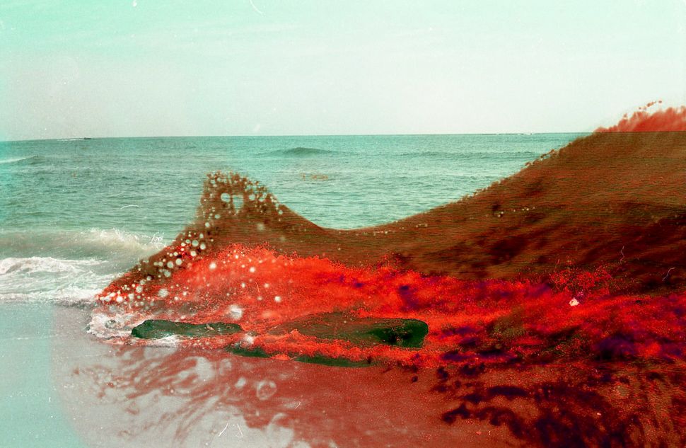
Wave effect:
|
|
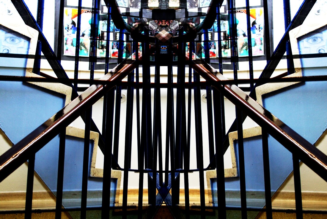
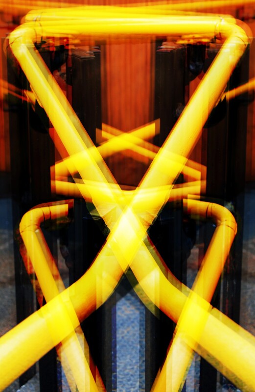
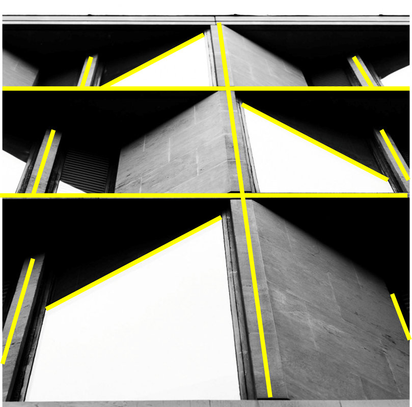
Best Image Evaluation / Digital Editing
|
|
I believe that this is my most successful final digital edit because it achieves a balanced and symmetrical outcome. The use of the element line is effective because of the conflicting and contrasting directions they go in- this results in a dynamic outcome, with the elements leaving the composition from different angles. The digital editing technique, the wave effect, is engaging in this photograph because it creates a feeling of repetition and automaticity - this results in a calming image because of its uniformity. Through the lines exiting the image at symmetrical angles, the final edit of the photograph and the individual elements feel well-balanced. The blue hue throughout the image is impactful because it further accentuates the harmony and balance of the photograph. On PIXLR, I increased the contrast of the photo and this is effective because it makes the conflicting lines in the image stand out and have individual impact. |
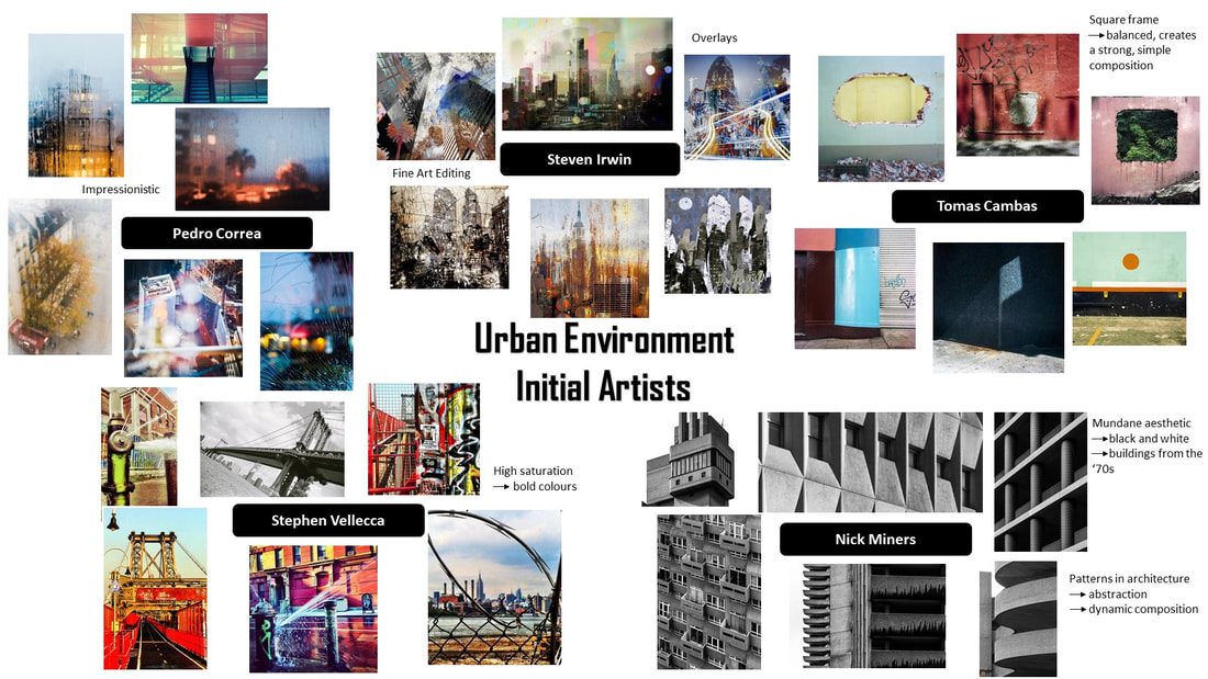
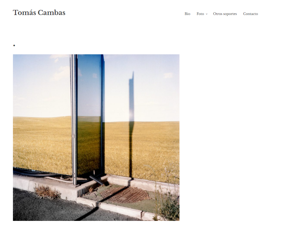
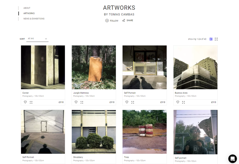
Artist Investigation / Tomás Cambas
"Tomás is one of the most talented and meticulous photographers I have come across lately. Not only does his subject matter and media make him unique, but the beauty and mystery that arises from his cityscapes too." - ENRIQUE MITJANS
|
I have chosen to investigate into the work of Tomás Cambas because I am inspired by his well-balanced and symmetrical imagery. Researching into the work of this artist will strengthen my photographs as I will appreciate more the balance of the elements within a final composition.
Tomás Cambas was born in Buenos Aires, Argentina and has enjoyed taking pictures since he was eight years old. He uses a square frame in his photographs which highlights his well-balanced compositions. I chose this quote about Tomás Cambas because it highlights the photographer's determination and talent in achieving successful final images - this drive for perfection within his photographs inspires me. To emulate his work, I will use the rule of thirds and a square frame to capture images of decaying walls and buildings. |
|
SEMI Analysis / Tomás Cambas
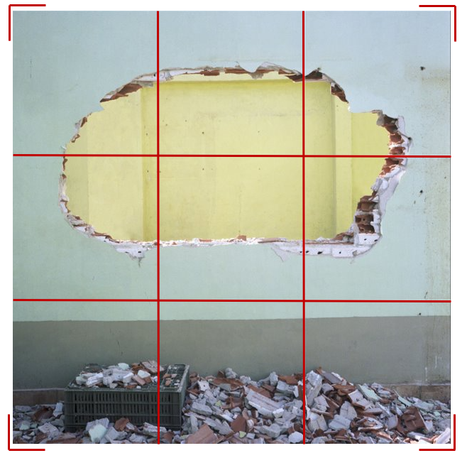
|
Subject:
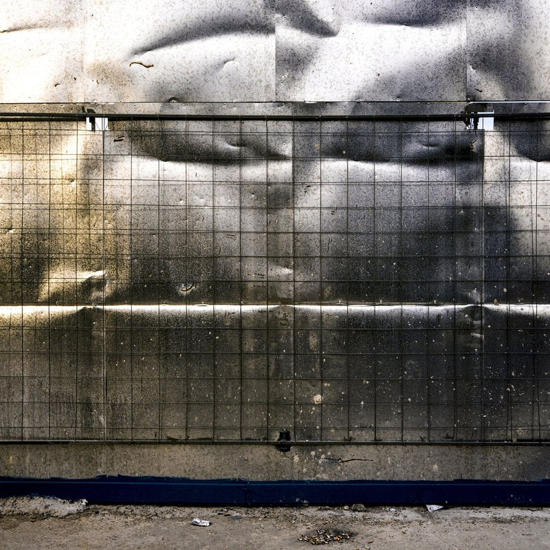
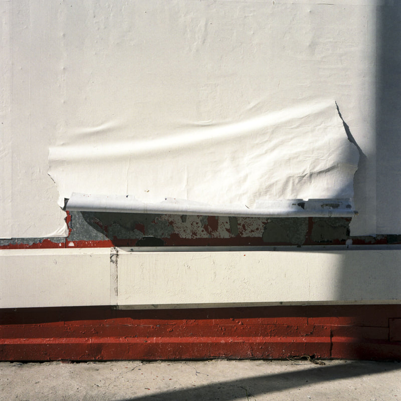
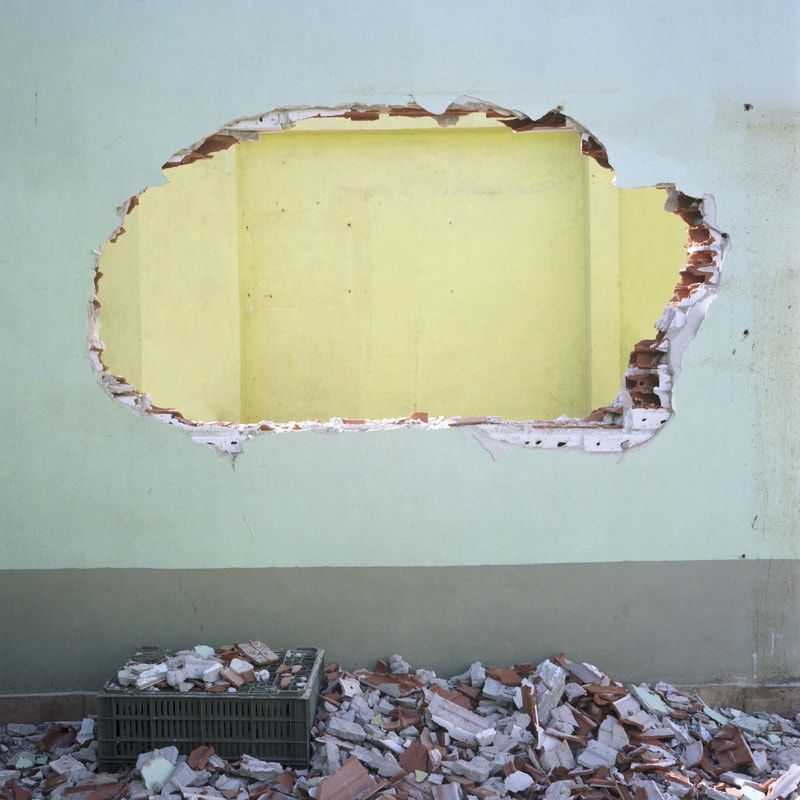
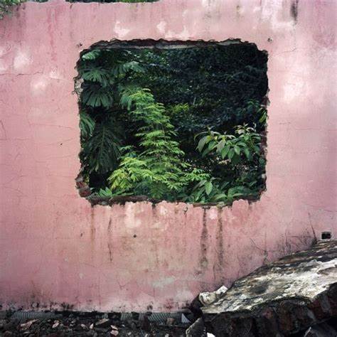
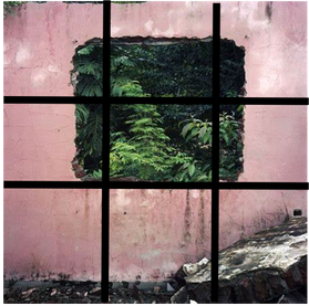
The photographer of this image is called Tomás Cambas, and this particular image is unnamed but is the first from the group called 'The hegemony of the square'. This image is inspired by the genre of landscape photography. A semi-obliterated brick wall is presented in this image, uncovering a second room, with rubble taking up the bottom of the image. Elements: In this image's composition, there is a destroyed brick wall in the centre of the photograph. This destruction is revealing a second room, adding depth to the composition and contrast between the blue wall of the closer room and the yellow wall of the room in the background. The viewer's eye is directed to the centre of the image because of Cambas' consideration of the rule of thirds, perspective and framing. The perspective of this photograph is eye level, this is effective because it captures the depth of field within the composition, as well as successfully using the rule of thirds to get the focal point in the centre. Tomás Cambas employs a range of visual elements into his work. Some of his most striking elements are colour, space, and shape. Colour has been successfully captured in this photograph, with the blue and yellow contrasting each other, emphasising the element of space within the composition. The element of shape is used well in this image, because the shape of the focal point is designed to capture the interest of the viewer by acting as a frame for the yellow wall behind. Furthermore, the shape of the frame of the overall image, a square, is used to achieve Cambas' desired outcome of balance. Media: The photo has been taken from a reasonably short distance, with a large portion of the wall being cropped out and leaving only the hole in the wall and the rubble from it on the floor. This is so the hole and the yellow wall behind will be the main focal point of the image. The pile of rubble has been placed in the foreground of this picture, by doing this the viewer's eye is lead here after the main focal point because of the rule of thirds and visual hierarchy. This photo has been taken in a derelict building using natural sunlight. The light is coming from above the subject, I can tell because the bricks on the floor and the brickwork in the wall are being highlighted by the light. This directs the viewers eye to those areas of the image and creates an atmosphere and sense of destruction. To emulate this photo myself, I would need to shoot on a bright, sunny day and find a derelict environment to capture in my image. Additionally, I would have to be confident in using the rule of thirds and be able to find interesting shapes in architecture. Intent: I feel the photo conveys a message of destruction and wreckage. It does this by making the destroyed wall the centre and focal point of the image. This photo is relevant to my project of urban environment because there is dereliction in these urban places, and there has to be destruction to make way for the new, well-developed structures to take their place. |

|
Shoot Plan / Tomás Cambas
I will complete a shoot inspired by the work of Tomás Cambas; I will emulate his balanced, square-framed and brightly coloured images. The shoot will take place outdoors at midday, because I will need to make the most of the natural daylight and use it to capture the different hues within the subjects I'm photographing. I intend to use urban, decayed architecture, such as weathered walls and doors, as my subjects for this shoot to emulate the photography of Tomás Cambas. The lighting conditions I will require are bright, natural daylight and my subject will be front lit because this will highlight the different elements within the composition when I'm using direct approach. When considering exposure, I intend to shoot with a fast shutter speed of 1/800, using my DSLR Canon 2000d, to create a crisp image. Also, I intend to use a larger aperture f/5 for a shallow depth of field. Following the shoot, I plan to digitally edit my images, adjusting the brightness, contrast and overall balance of the image.
Contact Sheet / Tomás Cambas
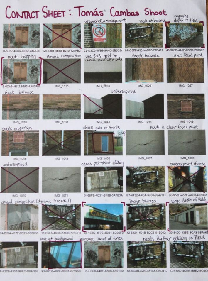
|

|
Edited Images / Tomás Cambas
Editing process:
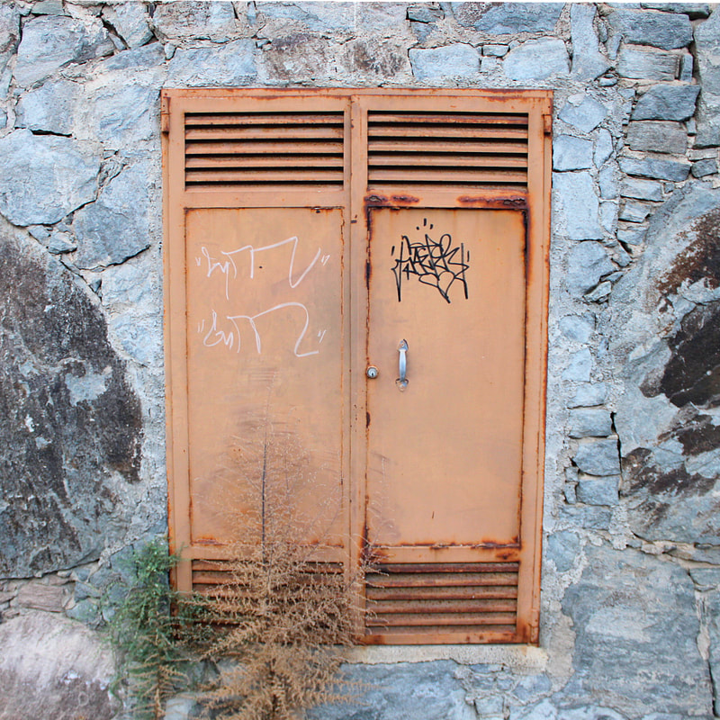
This is a successful image because it is well-balanced and follows the rule of thirds. It successfully emulates the work of Tomás Cambas.
Tomás Cambas' style is successfully emulated in this picture because the subject matter is well saturated and dynamically moves across/through the composition.
|
The elements in this image are well saturated so therefore this is a successful emulation of Cambas' work. I feel it has limitations because of the vantage point used to take this image.

This photograph is also dynamic and the saturation has been adjusted appropriately to match Cambas. However, the rule of thirds has not been evidently used in this image, as it is not balanced.
|
Best Image Evaluation / Tomás Cambas
|
|
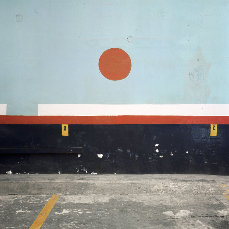
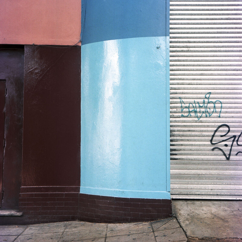
This is my most successful image because it follows the rule of thirds, like Tomás Cambas' work. The digital post-editing I did on this image is effective because the saturation has been increased which makes the subject matter stand out and the entire composition more dynamic and visually interesting. However, the weakness of this image is the vantage point because it is not exactly direct approach. Rule of thirds was thought of when taking this image and the result is a well-balanced photograph that emulates Cambas' strong, symmetrical compositions. To improve, I would take this image further away so the subject matter was smaller and the amount of negative space increased - this would improve the emulation of Tomás Cambas' photography. |
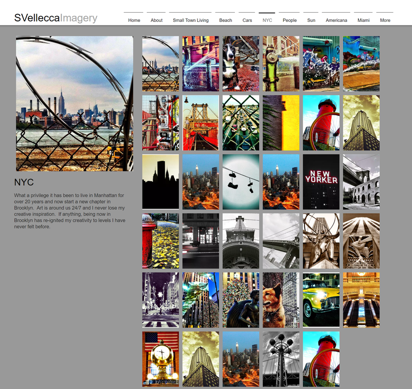
Artist Investigation / Stephen Vellecca
"Photos are like any art, they make people think, discuss or simply smile." - Stephen Vellecca
|
I have chosen to investigate the work of Stephen Vellecca as part of my continuation into my project of urban environment. His work consists of highly saturated, urban structures and he takes many of his images using an iPhone.
Stephen Vellecca lives in New York City and takes advantage of his local surroundings by capturing them in a unique and colourful way. He originally started taking pictures using a 1978 Canon Ae-1 35mm, then he taught himself and eventually transitioned to digital in 2007. Later, he tried different types of digital cameras, before eventually transitioning to iPhone photography. This quote, I believe, encapsulates the work of Vellecca; he has an extremely positive and bright outlook on photography and the joy it can bring to people. From this quote, you can tell how passionate Vellecca is about the medium, his upbeat opinion of photography is reflected in his final outcomes. To emulate his work, I would take inspiration from his spontaneous approach to his shoots. Vellecca captures his images on his iPhone so he can edit them wherever he is, also he never has to go out looking for inspiration, he can just shoot in the environment he is in when something captures his eye. |
|
|
|
|
|

|
|
"Photos tell a story for me, not in the most basic sense but in my imagination. I believe capturing a moment in time is an emotional experience and should cause a reaction in those that are viewing the photo. At least that is my intention." 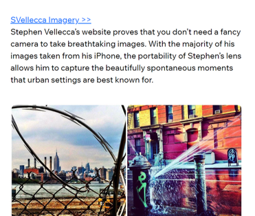
|
Comparative SEMI Analysis / Stephen Vellecca and Tomás Cambas
|
Subject:
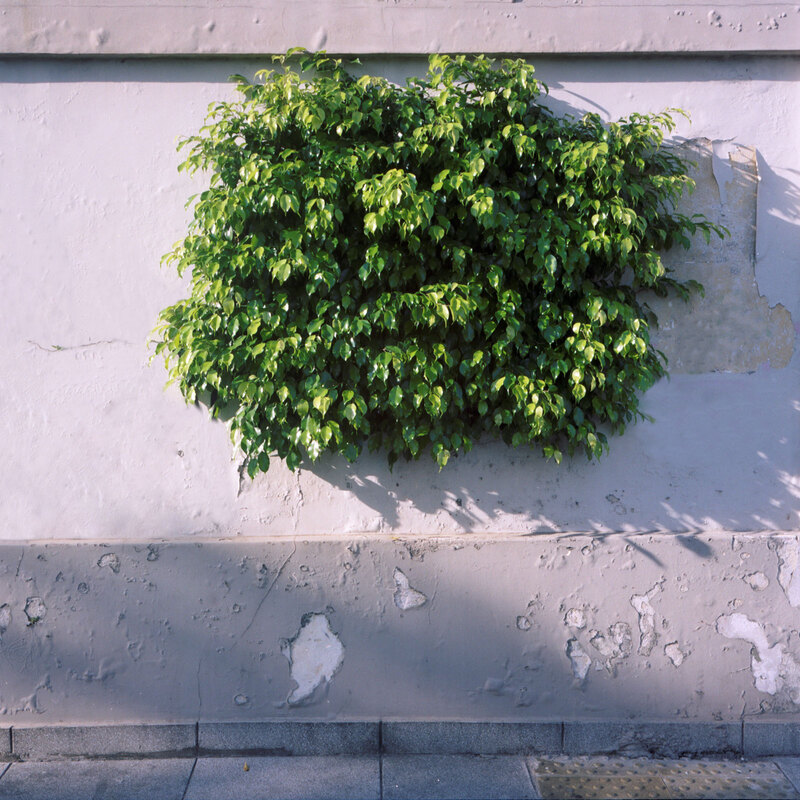
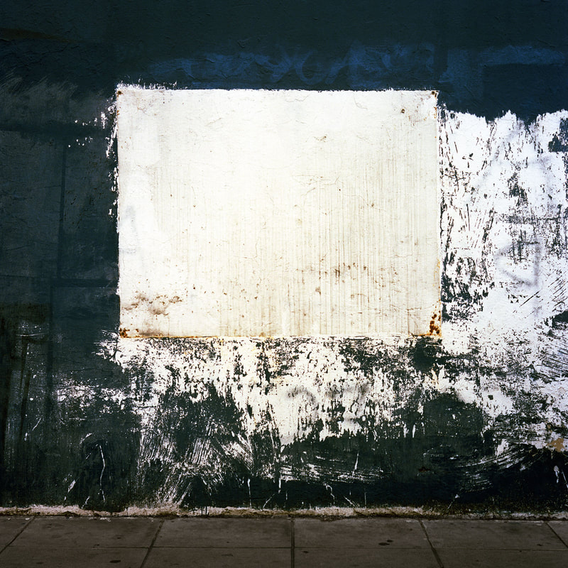
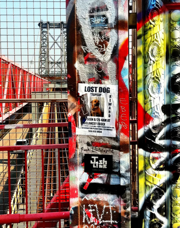
The photographer of the first image - titled "H"- is Tomás Cambas and the second image is Stephen Vellecca. Both images are examples of urban environment and landscape photography. Cambas' image depicts a decaying wall with a light pink hue; the centre of the wall has been removed and ultimately is revealing surrounding leaves with a strong and bold green hue. Vellecca's image has a very busy, dynamic composition with the focus being on a graffitied wall with posters and writing on it which is in front of a railway line going over a bridge. Elements: The composition of "H" shows the wall in the foreground with the focal point, the leaves, just behind in the middle ground. Similarly, Vellecca's image shows the wall in the foreground, however he also includes the architecture in the background with leading lines from the railway in the middle ground connecting the composition's two focal points. A similarity of the two images are the photographers' use of the rule of thirds, the focal points lie on the lines of the 3x3 grid, therefore having a strong impact on the viewer. Furthermore, the viewer's eye is directed to the centre of Cambas' photograph because of his use of a restful composition, the rule of thirds and the surrounding negative space; Cambas' imagery all employ symmetry and balance as main principals in the composition. Whereas, the viewer's eye is lead around Vellecca's photograph because of his use of leading and conflicting lines, as well as a dynamic and busy composition. Both images use direct approach - no special angles or distortion have been added to the images. However, Cambas has used the destroyed centre of the wall to cleverly frame and create the focal point of the leaves behind. Furthermore, Cambas employs a range of visual elements in his work; the most striking elements in this image are colour, space and shape. In this Stephen Vellecca example, colour is similarly one of the most striking elements but line and pattern are also very striking elements. Vellecca over saturates this image and as a result, the final composition increases in creativity and interest.
|
Stephen Vellecca
"H" Tomás Cambas
|
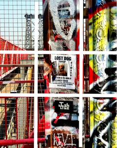


Media:
Tomás Cambas and Stephen Vellecca have both taken their images from a short distance with the leaves as the focal point in "H" and the graffitied wall and "lost dog" poster as the focal points in Vellecca's image. Both photos use a large depth of field, resulting in the focal points being put in context by revealing their surroundings. Both images have been taken outside using bright, natural sunlight - this use of lighting creates the joyful and positive atmosphere that this image evokes. Cambas' image has been taken using a DSLR camera with a tripod and square frame, whereas Vellecca has only used a smartphone camera, this conveys his unplanned and spontaneous photography style.
Intent:
I feel Vellecca's image is very expressive and energetic because of the bold and bright colours within the composition. Whereas, Cambas' image evokes feelings of calmness because although there is a similar use of bold colours, they are quite dull in the final composition because they haven't been over saturated like Vellecca's.
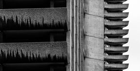
Artist Investigation / Nick Miners
|
      |
|
|
|
|
|
I chose to investigate this artist because his work differs from the two previous photographers I have researched, both of which use the element of colour quite significantly in their final composition.
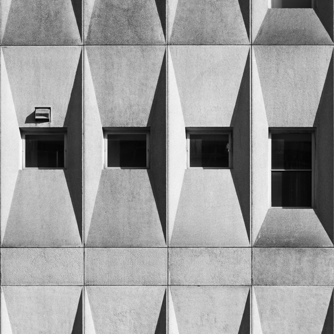
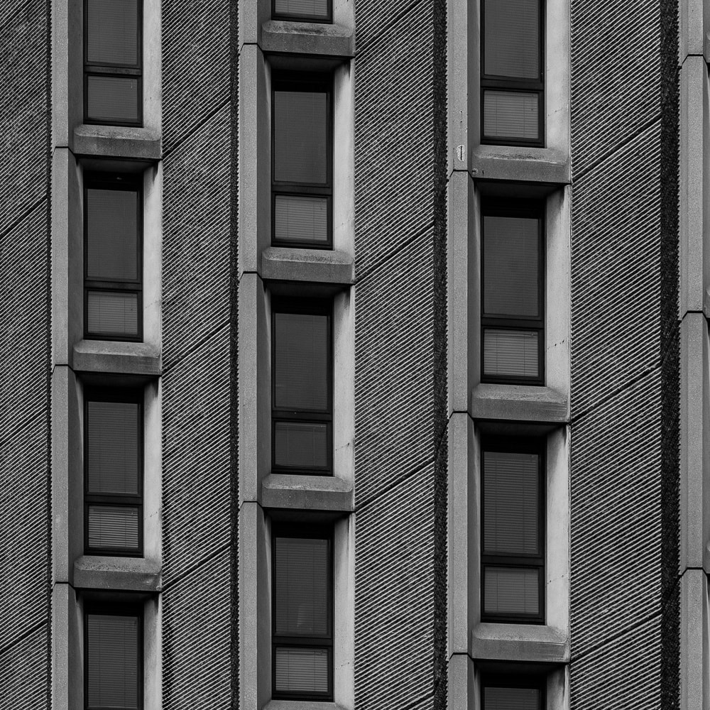
Nick Miners is a British photographer currently living in Bath, he is fascinated by architecture and captures geometrical patterns within buildings in stunning black and white. This quote explains the effective and stylistic outcomes Miners achieves because of the passion he has for architecture photography. To emulate Miners' work I would have to explore my local architecture and try and capture different geometrical patterns within them, before desaturating the final images. |
"I am passionate about architecture and interior design photography. I love nothing more than to explore an interesting building whether it’s still being dusted off or has been standing for centuries." - Nick Miners 
^ Nick Miners' Website
|
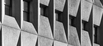
SEMI Analysis / Nick Miners
|
Subject:
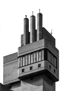
Nick Miners is the photographer of this image, and this particular image is titled 'Urban Geometry, Oxford Street'. This image is inspired by London architecture and the genre of landscape photography. A architectural wall is presented in this image, the unique vantage point revealing geometric shapes and patterns within the building. Elements: The composition of the photo shows the wall in the foreground, moving into the middle ground, then background as the viewer's eye is lead from the bottom of the composition to the top due to the prominent leading and angular lines. The photo has a range of tones and levels, Miners also manages to capture the highlights and shadows caused by the natural light. Miners has used a below vantage point, this is effective because it captures the perspective of urban habitants and expresses the beauty and skill that has gone into the architecture. Nick Miners employs a range of visual elements into his work, the most striking elements are line, shape and pattern. Media: This image has been taken from a short distance, with only a small section of the wall being included in the final composition, resulting in a dynamic and abstracted image. There is no particular focal point in the image, the viewer's eye is lead around the photo to the highlighted areas and the areas in shadow, joined together with leading lines. This photo has been taken outdoors in an urban, city environment and uses natural sunlight. The light hits the subject from above, resulting in the windows of the wall reflecting the sunlight. This directs the viewers eye to those areas of the image and emphasising the geometrical patterns within the architecture. To emulate this photo myself, I would need to shoot on a bright, sunny day, find a modern building and experiment with interesting vantage points and perspectives. Intent: I feel Miners is trying to express the beauty of our surroundings and how modern-day, contemporary architecture is artistic and inspired in it's design and construction. He does this by using an artistic eye to capture the geometry and leading lines within the building. This artist's work is very relevant to my project of urban environment because it celebrates present-day architecture and how city environments are developing with this innovative construction and artistry. |

|
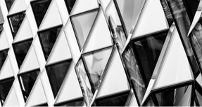
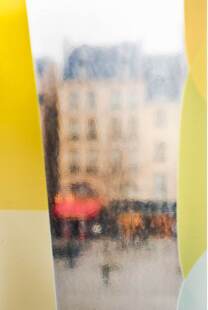
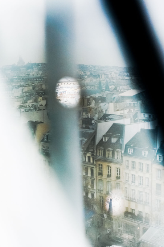
Artist Investigation / Pedro Correa
|
|
|
|
|
|
|
|
|
|
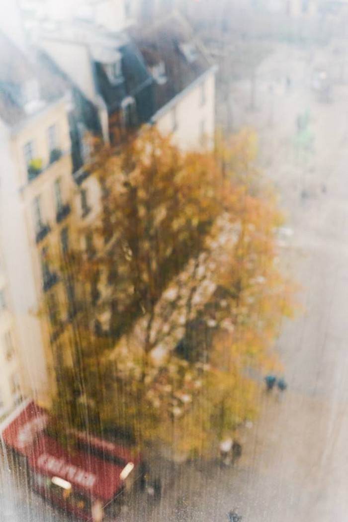
I have chosen to investigate the work of photographer, Pedro Correa. His distorted, urban imagery is unique and I find this individuality in photographic style inspiring. Correa also uses warm, calm and low contrast colours which is what I believe makes his work so gentle overall.
Pedro Correa is a fine arts photographer with a painting background, studying oil painting and comic arts studies at Brussels Royal Academy of Arts. His work is impressionistic; Correa describes his style as 'shooting with one eye of an impressionistic painter and one eye of an urban image hunter'. I feel this quote reflects Correa's art background and demonstrates his fine art photographic style. To emulate Pedro Correa I will find aesthetic and pleasing to the eye examples of architecture and urban environment to photograph. Natural light will be used and I will experiment with different methods of distortion. |
"The technique does not interest me, the technique for me is to press a button; in photography everyone can do it, the important thing is the eye, the camera is just a means to capture what your eye is seeing." - Pedro Correa 
|
|
|
Comparative SEMI Analysis / Nick Miners and Pedro Correa
|
Subject:
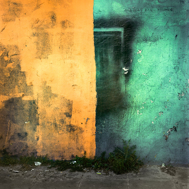
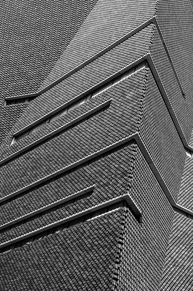
The photographer of the first image is Nick Miners and the second image is Pedro Correa. The two images are both examples of urban landscape photography. Miners' photo depicts a desaturated wall of a London apartment building. Whereas, Correa's photo is a distorted perspective of a surrounding Parisian building. Elements: The composition of Miners' image is dynamic and shows only a small section of the wall and windows, this focal point is entirely in the middle ground. However, Correa's image has a restful composition and the entire building can be seen in the background. The two photographs have different perspectives, Correa's from a window high up, looking down on the Parisian architecture and Miners' from street level, looking up slightly and zooming in, to capture the subject in clear detail. Furthermore, the viewer's eye is directed to the centre of Correa's image where the contrasting colours of the building and the leaves create the focal point of the photograph and because of his use of a restful composition and surrounding negative space. Whereas, the viewer's eye is lead around Miners' photograph because of his use of leading lines, symmetry and pattern resulting in a balanced yet dynamic composition. The most striking difference of the two images is the element of colour and how its absence in Miners' image creates a mundane and dull atmosphere but it's distorted presence in Correa's image evokes feelings of hope and positivity. Media: Nick Miners and Pedro Correa have both taken their images from a long distance, capturing the perspective of the London and Paris residents who encounter these buildings. Both photos use a large depth of field, resulting in the focal point of Correa's photo being put into context by revealing its surroundings. Both images use bright, natural sunlight but whilst Miners' image was taken outdoors, Correa's image appears to be taken indoors through a high window. Intent: I feel Miners' image creates a dull atmosphere as it is very understated and mundane because of the monochromatic, desaturated outcome within the composition. Whereas, Correa's image evokes feelings of calmness and hope because there is a use of soft, light-toned and delicate colours, they are quite muted in the final composition because they have been reduced in contrast and distorted. |

Pedro Correa
Nick Miners

|
Shoot Plan / Pedro Correa
|
For this shoot, I have drawn inspiration from the work of Pedro Correa because his work incorporates a lot of harmonious colours and I like how his finished outcomes evoke a calm atmosphere. I plan for the shoot to take place in my local urban environment and abroad because there will be lots of opportunities to take pictures of architecture when I'm on holiday in the Canary Islands. In these different environments, there are lots of interesting architectural buildings and harmonious tones which will provide lots of opportunities to emulate Correa's work. The equipment I intend to use is my DSLR Canon 2000d camera because I will be taking mainly candid shots, so I won't have the opportunity to set up a tripod or additional lighting. In regards to lighting, the conditions I will require are natural daylight and my subject will be lit from all directions. My camera settings will be set to a fast shutter speed to get a crisp image with no blur or aberrations. Following the shoot, I plan to digitally edit my images using PIXLR and I will enhance the colours and tones. Furthermore, I will adjust the contrast and experiment with adding a vintage effect or a golden hour effect.
|

|
Contact Sheet / Pedro Correa
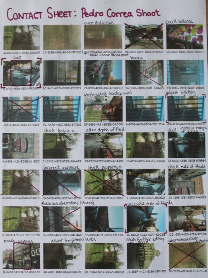
|
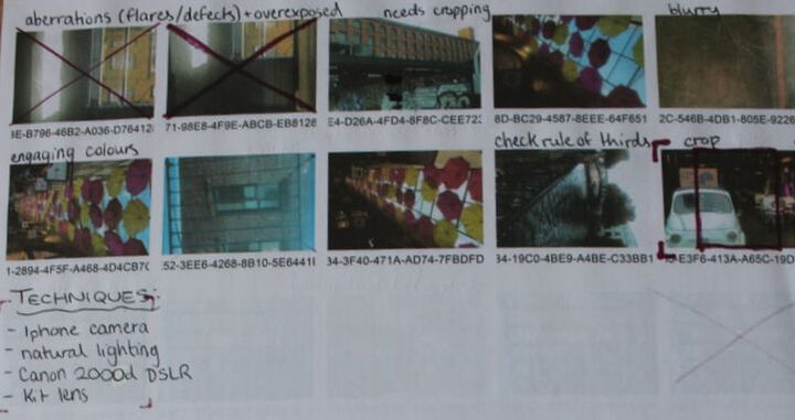
|
Edited Images / Pedro Correa
Editing process:
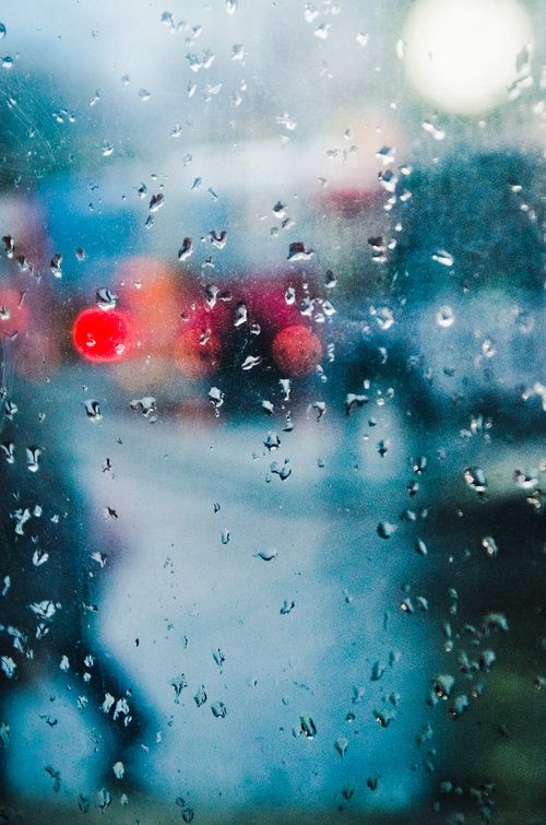
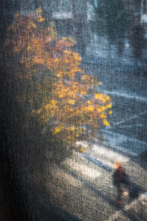
This is a successful edit because the subject matter is distorted like Correa's images and the rain drops are in focus. However, there is a lack of bold colours so the overall image is quite dull.
I think that this edit is effective because of the level of distortion on the image's focal point and the clarity of the overlays - this is a successful emulation of Correa's work.
|
Effectively, this image emulates Correa's work which focuses on clarity rather than distortion. Some photos of his I initially researched dealt with dynamic strokes of light across the image.
This edit is successful because the composition is distorted and therefore the highly saturated elements stand out further in the blurred focus point.
|
This edited image is an engaging emulation of Pedro Correa. I blurred the image and sharpened the overlay to achieve this outcome.
|
I find this photograph successful because of the bold colours that I emphasised in post-edit.
|
Best Image Evaluation / Pedro Correa

|
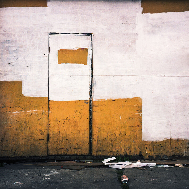
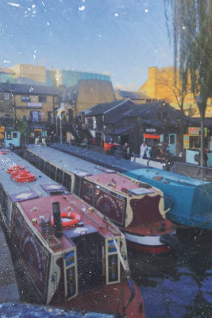
I believe that this is my most successful edited image from my Pedro Correa investigation because the element of colour is very evident in the final composition. The photograph is slightly distorted like Correa's work but the focal point is still distinguishable. The highly saturated, bold and contrasting colours complement each other in this final outcome and they result in a warm, composition that successfully emulates Pedro Correa's unique style. This is my most successful outcome because the focal points, the boats, cut across the image making the photograph more dynamic. These boats are also effective because they add the element of line into the composition and these leading lines are engaging, visually interesting and capture the viewer's attention. Also, the natural sunlight highlights the buildings in the background which adds depth to the image and links well to my theme of urban environment. |
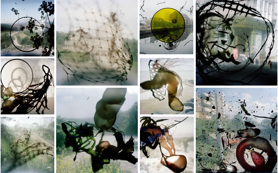
Composition Design 1 Initial Inspiration
|
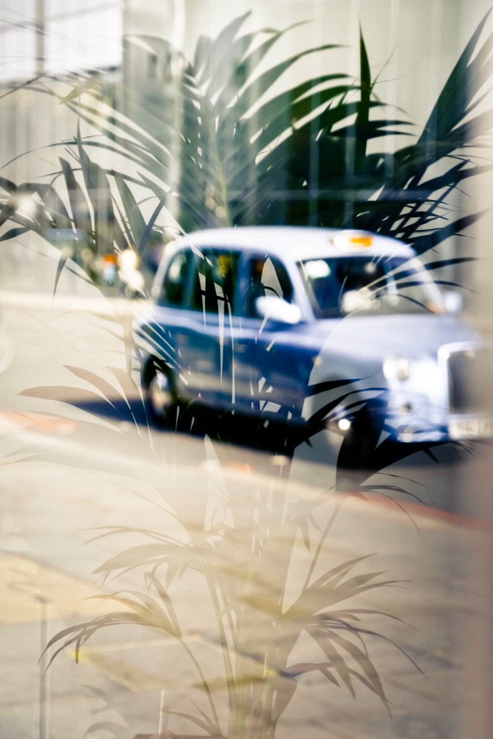
I am inspired by the work of British photographer, Stephen Gill. Particularly, I enjoy Gill's photography in which he obscures the subject matter with different overlays with unique forms and shapes.
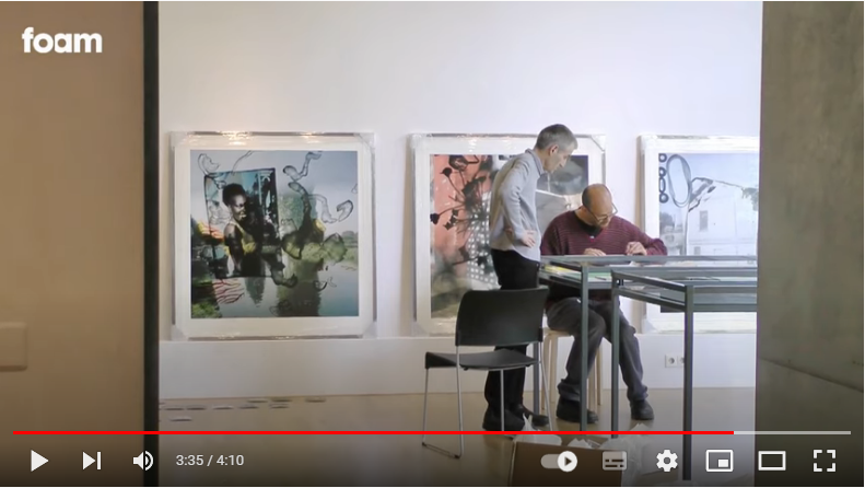
For my composition design, I would like to emulate Stephen Gill's images by using my photographs from previous urban environment shoots. I will need to create dynamic overlays and I plan on doing this by applying inks and paints onto acetate before digitally scanning them in so I can superimpose the two together using PIXLR. To conclude this project, I would like to create a digital E-book which presents my edited images. The videos and images I have researched show Gill's impactful photography and one way in which I could create my overlays with acetate. |
|
|
|
Composition Design 1
Composition Design 1 - Aim:
Stephen Gill has inspired this composition design because I found his 'Talking to Ants' and 'Outside In' collections visually creative, unique and engaging. The overlaying technique will heavily feature in the development of this project's final outcome; I am going to create physical overlays, as I initially researched, to emulate Gill's style. I hope my final images will create the sense of having a fractured vantage point and therefore having a developing opinion of a certain place or subject. The distortion I plan on incorporating in my final composition will convey and emphasise the confusion and internal deliberation during the forming of an opinion or overall outlook. I would like to present my final set of work as an E-book because I believe this would result in a more dynamic and effective final outcome.
Stephen Gill has inspired this composition design because I found his 'Talking to Ants' and 'Outside In' collections visually creative, unique and engaging. The overlaying technique will heavily feature in the development of this project's final outcome; I am going to create physical overlays, as I initially researched, to emulate Gill's style. I hope my final images will create the sense of having a fractured vantage point and therefore having a developing opinion of a certain place or subject. The distortion I plan on incorporating in my final composition will convey and emphasise the confusion and internal deliberation during the forming of an opinion or overall outlook. I would like to present my final set of work as an E-book because I believe this would result in a more dynamic and effective final outcome.
"Everything we hear is an opinion, not a fact. Everything we see is a perspective, not the truth." ~ Marcus Aurelius |
"The only thing you sometimes have control over is perspective. You don't have control over your situation. But you have a choice about how you view it." - Chris Pine |
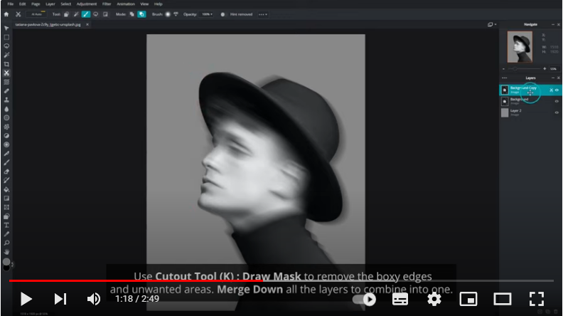
Composition Design 1 - Techniques / Photographers:
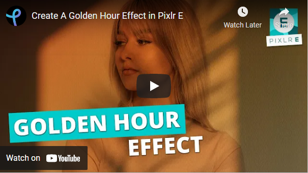
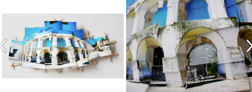
As previously mentioned, my composition design will be heavily influenced by the work of Stephen Gill and his distortion/overlay techniques which feature significantly in his work. Therefore, my designs will include the technique of digitally scanned, but hand created with different mediums, overlays that will be blended with my urban environment photography. However, to amplify my aim of distortion further, I plan on digitally applying the technique of motion blur to my urban environment images, using PIXLR (as seen in the video below). I will be using my photographs from my Pedro Correa shoot because these also include a level of distortion - inspired by Correa's style of photography. Finally, influenced by Spanish photographer Isidro Blasco, I will present my final collection of outcomes as an E-book because I find that this presentation can be more dynamic and perceptive.
As previously mentioned, my composition design will be heavily influenced by the work of Stephen Gill and his distortion/overlay techniques which feature significantly in his work. Therefore, my designs will include the technique of digitally scanned, but hand created with different mediums, overlays that will be blended with my urban environment photography. However, to amplify my aim of distortion further, I plan on digitally applying the technique of motion blur to my urban environment images, using PIXLR (as seen in the video below). I will be using my photographs from my Pedro Correa shoot because these also include a level of distortion - inspired by Correa's style of photography. Finally, influenced by Spanish photographer Isidro Blasco, I will present my final collection of outcomes as an E-book because I find that this presentation can be more dynamic and perceptive.
|
I plan on creating physical versions of similar ink designs on acetate
|
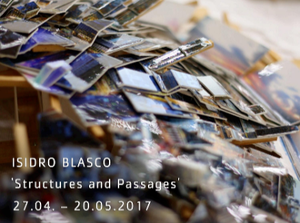
Isidro Blasco E-book
|
|
Composition Design 1 - Physical Experiments Plan:
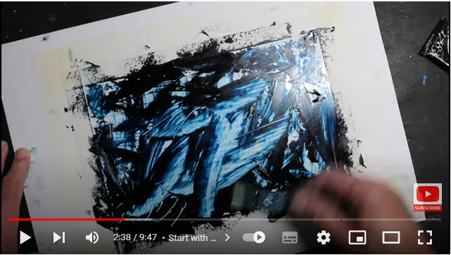
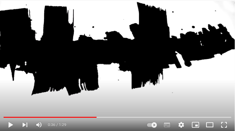
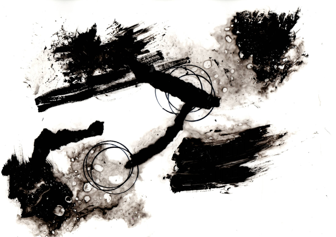
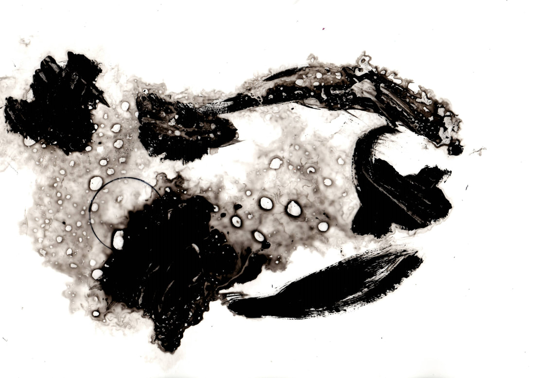
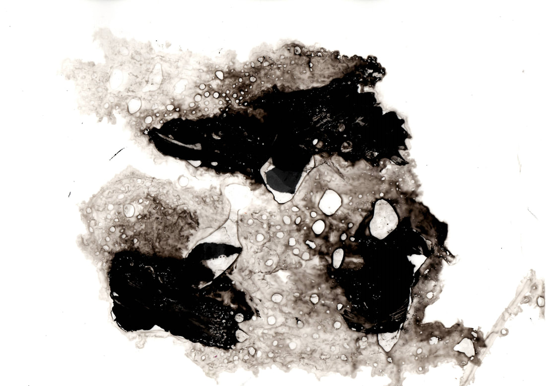
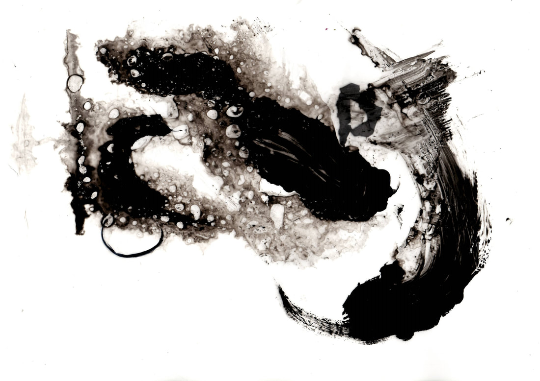
Now, I need to create my physical acetate overlays that will be scanned in to later digitally layer over my original distorted images. I plan on being experimental with my acetates, therefore I will create some practise designs to trial out different methods and mediums, such as paint and markers. For this, I have taken inspiration from Stephen Gill and his use of layering for (sometimes minimalist) effect. In my initial research, I discovered a video which demonstrated creative designs on acetate and I plan on using this as a slight guide when creating my first few acetates. I have also researched some examples of designs that I could potentially emulate on my acetates.

|
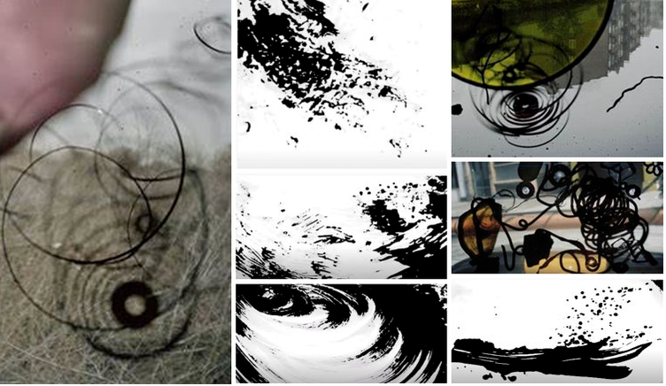
|
Composition Design 1 - Development of Ideas:
I created some physical overlays on plastic sheets by using black acrylic paint, a permanent marker, torn pieces of paper, a paintbrush and some water.
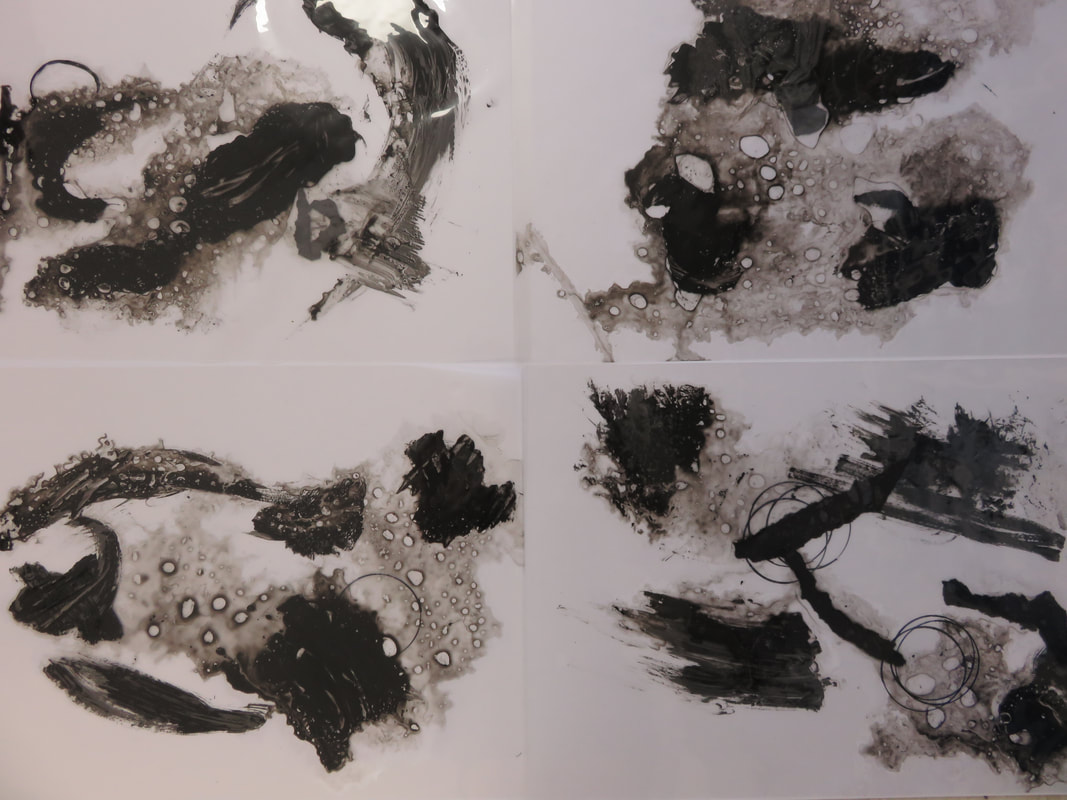
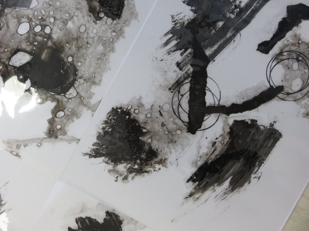
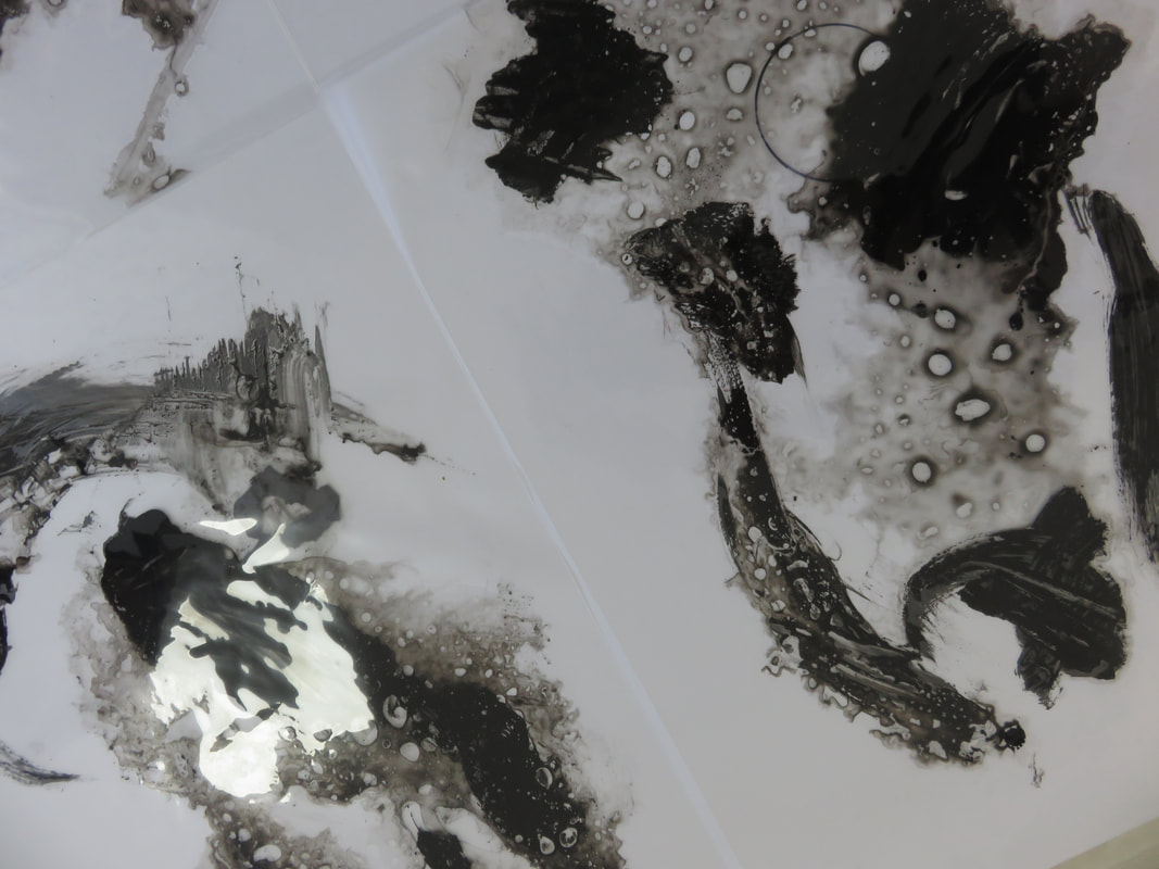
I then digitally scanned them so I could apply them to my final composition designs.
|
|
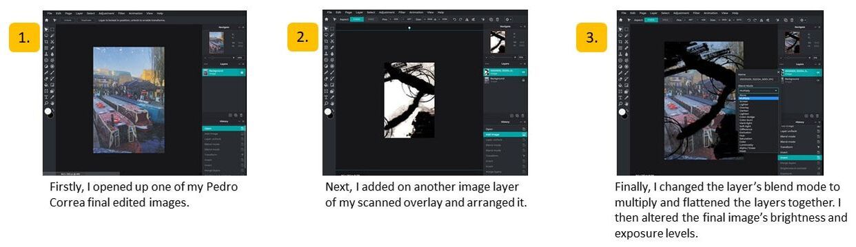
Then, using PIXLR, I...
Composition Design 1 - Best Images:
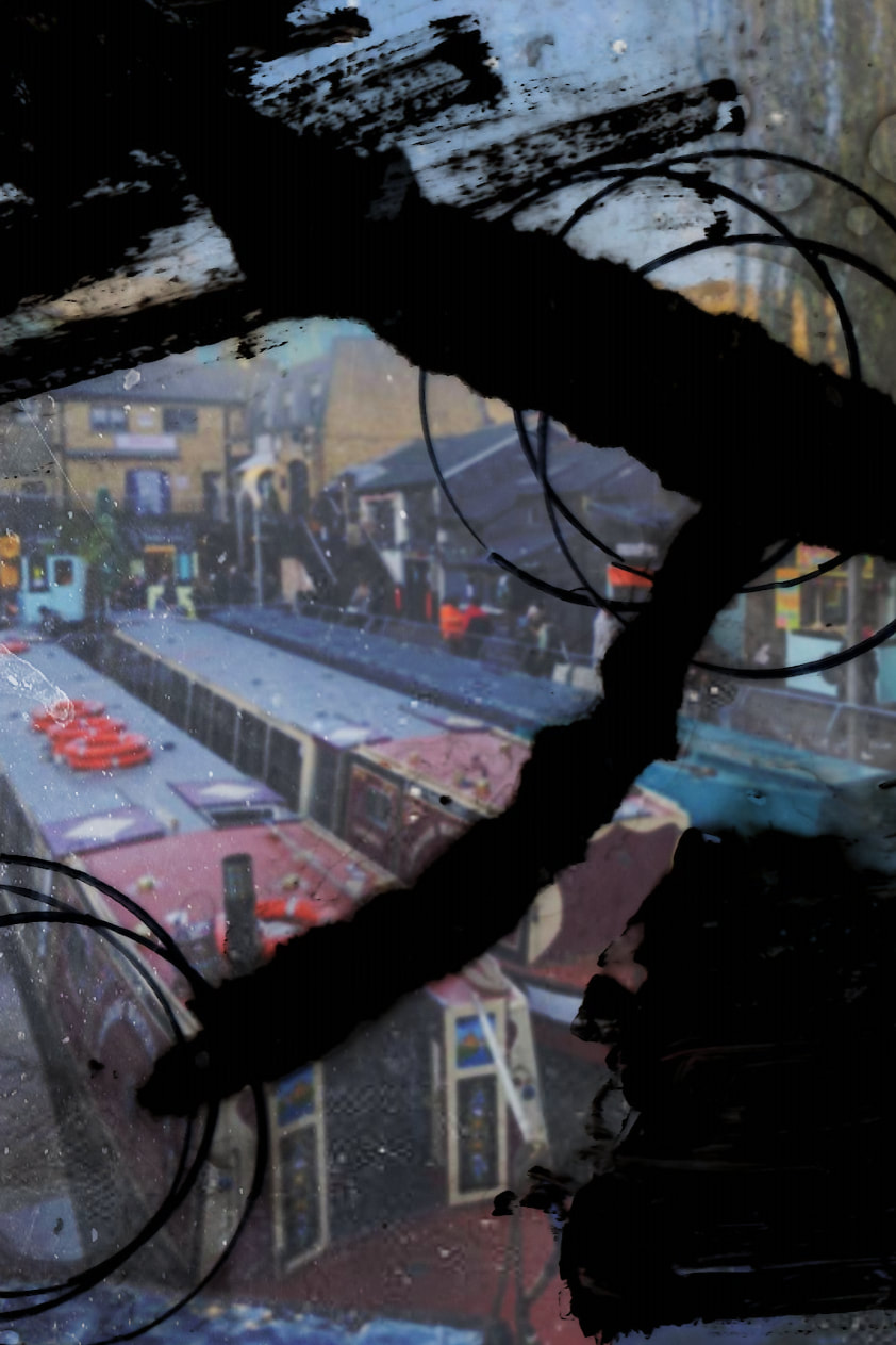
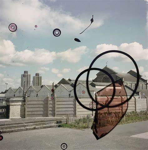
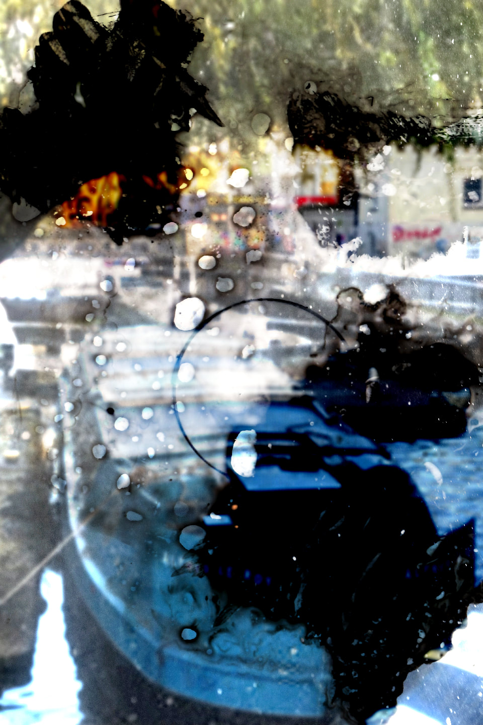
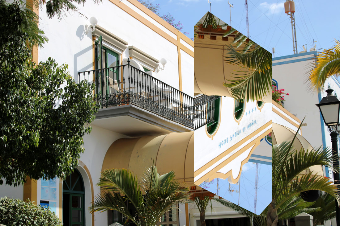
This edit was achieved by superimposing my overlays using PIXLR. I chose the blend mode 'multiply' and this is effective because it makes the shapes on the overlay stand out and highlights elements within the original image underneath.
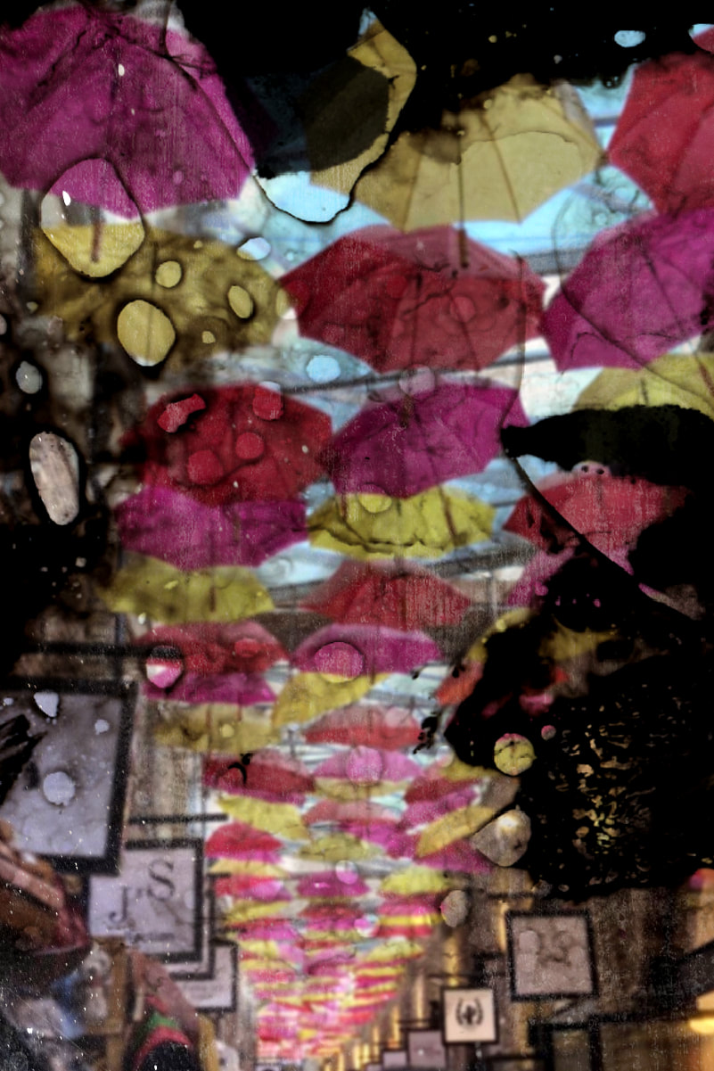
I believe that this is the least successful final outcome because the photograph's composition is too busy and overcrowded. The extensive use of circles is confusing and therefore the focal point is disguised and hard to distinguish.
|
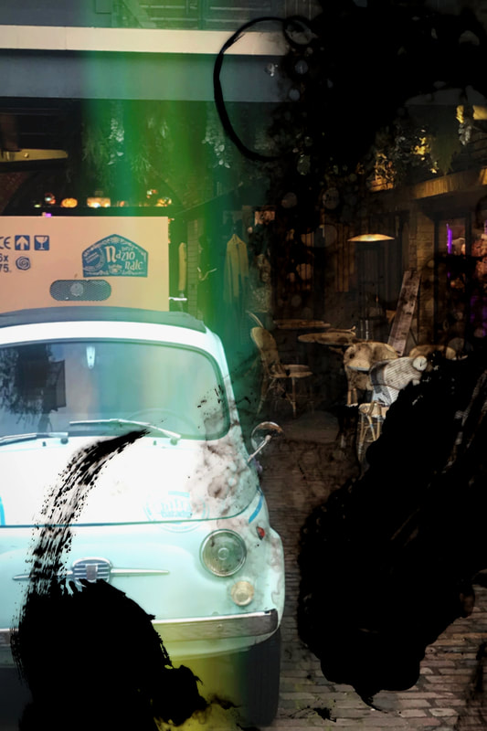
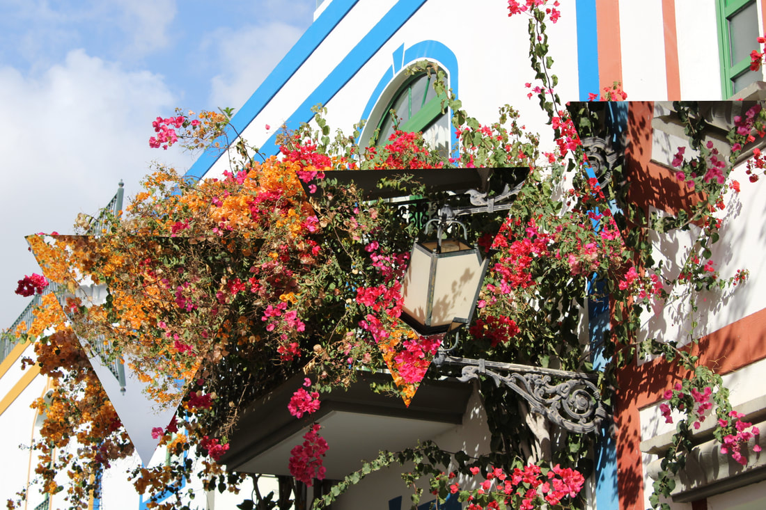
In this outcome, the overlay is effective because it frames the interesting elements within the original (Pedro Correa emulated) photo. Elements such as the bold blue in the foreground and the ambient lighting in the background are brought to the viewer's attention through the use of an overlay.
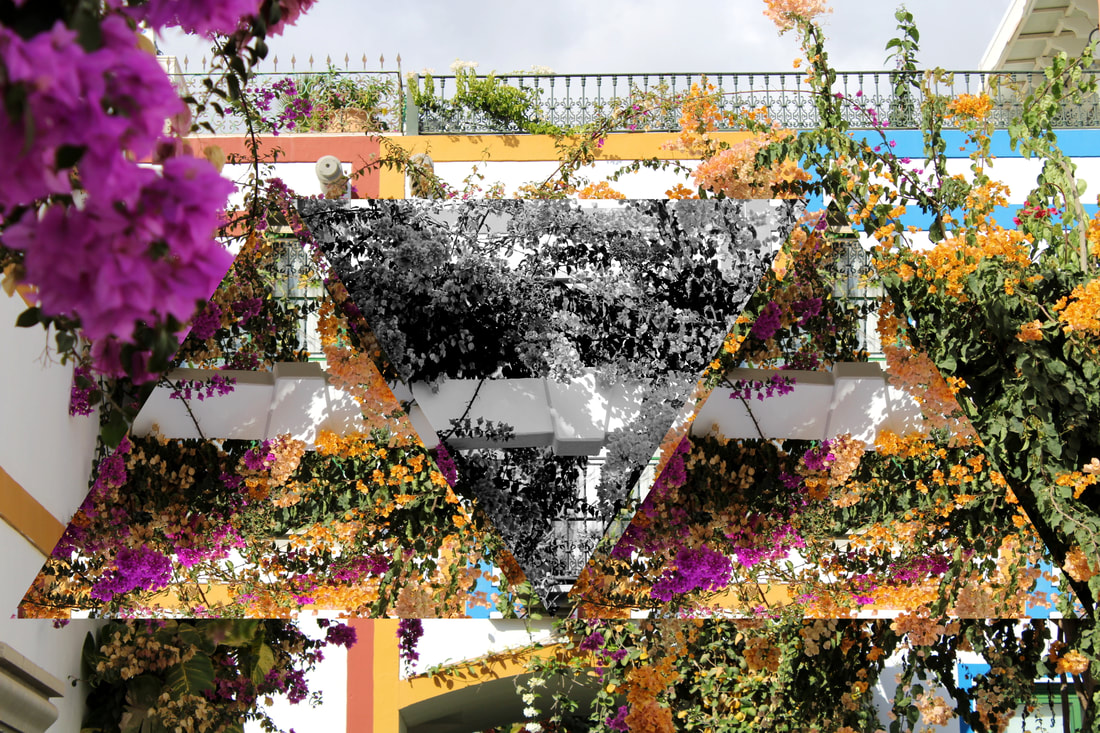
When editing this image, I chose a different blend mode than my previous three edits. I chose the blend mode 'overlay' because I found that this resulted in a more dynamic outcome that emulated the work of Stephen Gill successfully. This is my most successful outcome because it lacks clarity (like Stephen Gill's work) and therefore it results in an ambiguous, abstract composition.
|
Composition Design 1 - Final Outcome Evaluation:
My E-book
Final Outcome Evaluation
I believe that my Composition Design 1 was a success because I created a series of dynamic, artistic and unique final outcomes. The creation of physical overlays strengthened my photographic skills because I had to use mixed media; I had to experiment and couldn't really rely on much previous experience during this process, therefore I found the development of this Composition a learning experience and an opportunity to be more creative.
To develop this further, I could use a wider variety of colours in my overlays and experiment with different mediums. Also, I could present my outcomes in a physical, more creative way to make them more visually interesting.
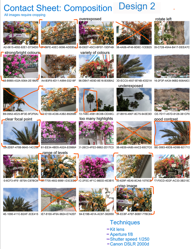
Composition Design 2
Composition Design 2 - Aim:
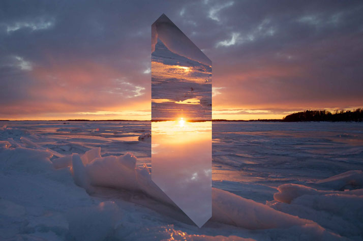
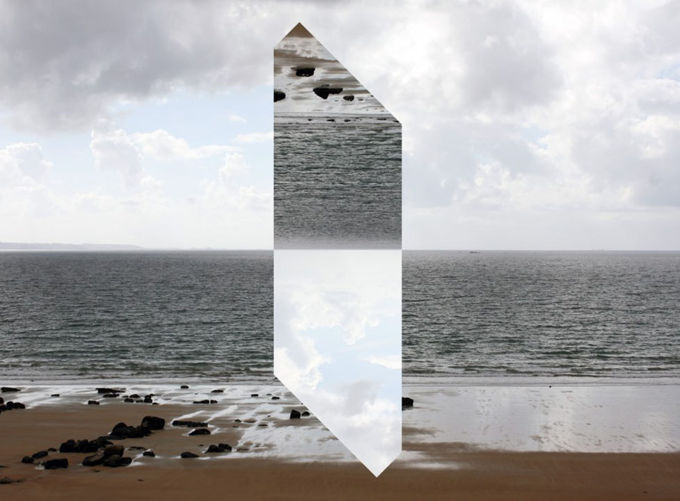
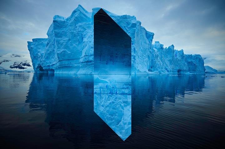
French photographer Reynald Drouhin has inspired my second composition design because I enjoyed researching his minimalist and contemporary work. I believe that attempting to emulate this photographer's work, will strengthen my digital editing skills. The simplification he employs in his work results in a unique and engaging final image. I am going to create a series of emulations by using the same digital editing tool as Drouhin. My final outcomes will hopefully be equally as dynamic with a strong focal point as Drouhin's work.
French photographer Reynald Drouhin has inspired my second composition design because I enjoyed researching his minimalist and contemporary work. I believe that attempting to emulate this photographer's work, will strengthen my digital editing skills. The simplification he employs in his work results in a unique and engaging final image. I am going to create a series of emulations by using the same digital editing tool as Drouhin. My final outcomes will hopefully be equally as dynamic with a strong focal point as Drouhin's work.
"Monochrome and minimalist spaces are becoming more important. I like going towards an aesthetic simplification." - Reynald Drouhin |
"I like effective stuff, which deals with complex concepts but in a simple way." - Reynald Drouhin |
Composition Design 2 - Techniques / Photographers
|
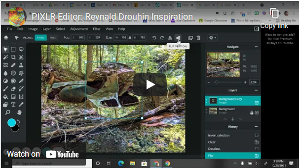
I will be using the digital mirror editing technique that Reynald Drouhin uses in his photographs. I have found a video tutorial that shows how I can emulate this technique using my usual editing platform, PIXLR. Also, when using this platform I can ensure that my images follow the rule of thirds and are well-balanced; this is important because Drouhin's work is always balanced and symmetrical.
|
|
Composition Design 2 - Development of Ideas:
I am going to use the photographs that I used some of in my Portrait & Identity project, and took when visiting Gran Canaria last year.
Editing process:
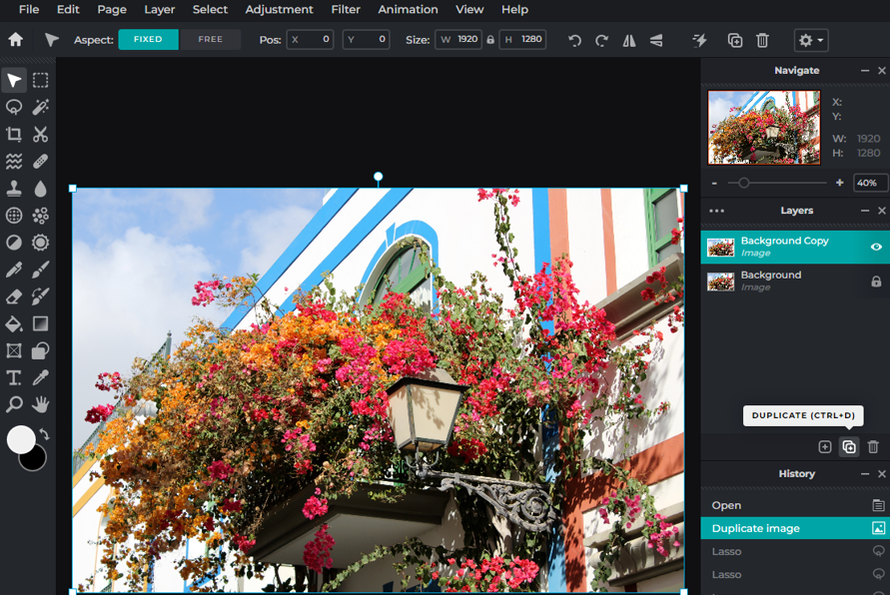
To begin, I duplicated the image so I had another layer to work with.
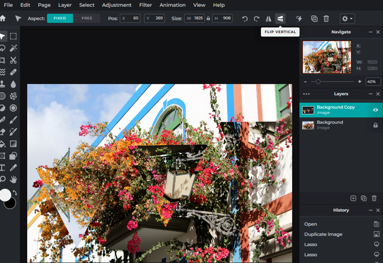
Then, I flipped the cut out shapes vertically.
|
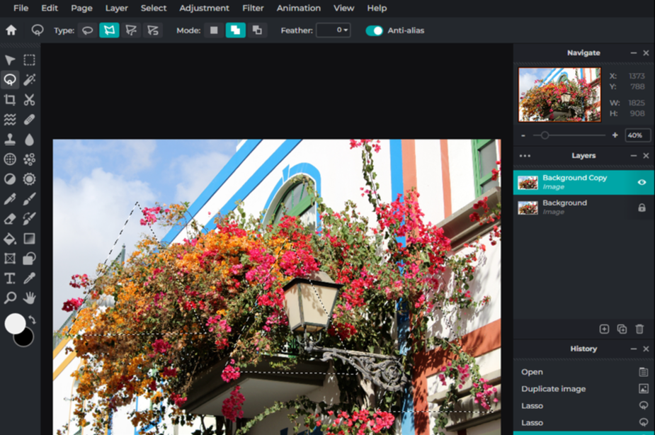
Next, using the polygon lasso tool, I created three triangles on my new layer.
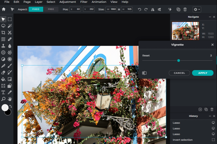
To add more depth to the image and to increase the contrast, I then added a vignette filter to the shapes.
|
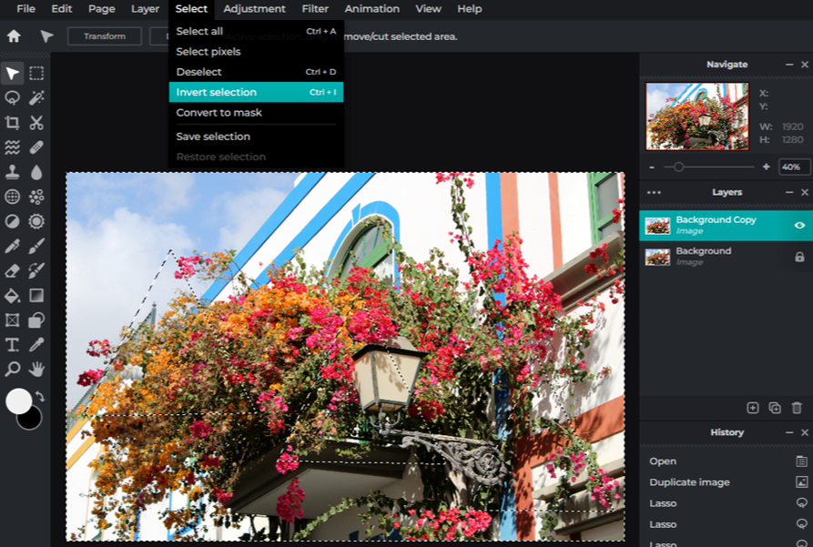
After that, I inverted my selection and deleted the areas not initially selected.
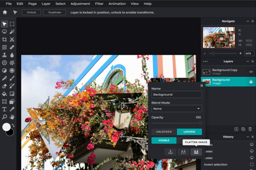
Finally, I flattened and merged the layers together to get my final image.
|
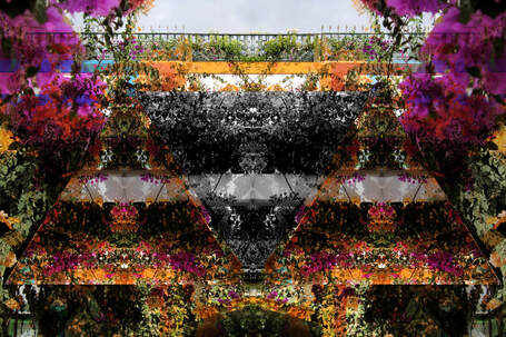
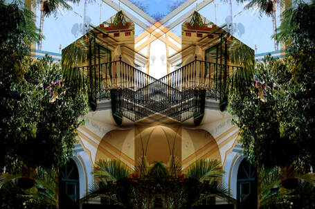
Composition Design 2 - Best Images:
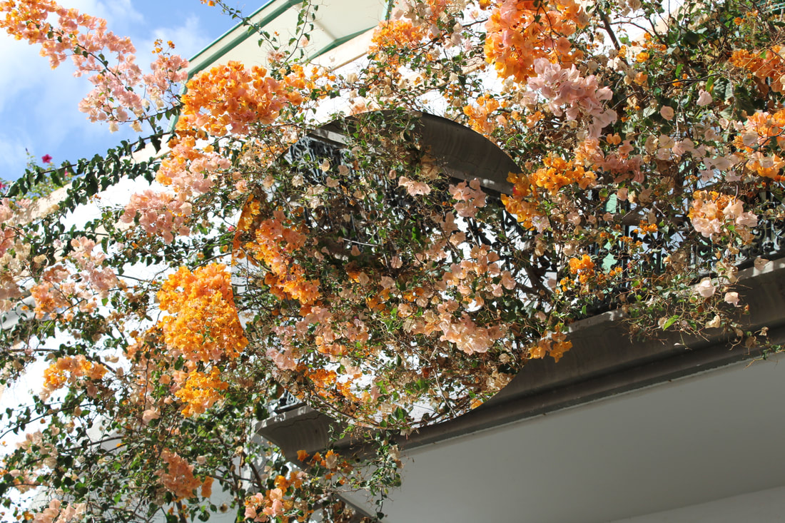
This is an effective outcome because the circular, flipped focal point is quite subtle and not overly noticeable. This results in an engaging and pleasing discovery for the viewer.
This outcome is heavily influenced by Reynald Drouhin's work because I wanted to create a similar balanced, calming image.
|
I believe that this a successful outcome because I find that the ascending upside down triangles are dynamic and add depth to the image.
To draw attention to the geometric shapes in this image, I desaturated one of the triangles. This was to make them more noticeable for the viewer.
|
Following this, I decided to apply some of my multi-layering, digital editing skills that I developed earlier in this project...
|
|
Composition Design 2 Final Outcome Evaluation:
Final Outcome Evaluation
I would say that my second composition design was a success because I created two different series of images. I experimented with a variety of digital editing techniques that I have developed during this project, therefore I believe this is an impactful way to end my final photography project.
I would say that my second composition design was a success because I created two different series of images. I experimented with a variety of digital editing techniques that I have developed during this project, therefore I believe this is an impactful way to end my final photography project.
Final Evaluation / Urban Environment
Throughout this project I have developed my understanding of urban environment by investigating the work of photographers who specialise in this theme and exploring new digital and physical editing techniques that can enhance my original images. Initially, I researched the work of Argentinian photographer Tomás Cambas. Through studying this artist and carrying out a SEMI analysis into one of his images, I was able to explore concepts of balance, harmony and symmetry and employ these principles in my own photography examples. Inspired by Cambas' work, I created a series of emulations by carrying out a shoot in a city centre and capturing images of architecture using the rule of thirds. His work helped me understand the theme of urban environment by conveying the unnatural yet balanced sense of harmony that can be found in modern and past architecture.
Next, I researched the work of American photographer Stephen Vellecca whose work I was intrigued by because of his use of vibrant and energetic colours. Through studying this photographer, I was able to explore concepts of colour, line and framing. I carried out a SEMI analysis, comparing Vellecca's work with my previously studied artist, Tomás Cambas. Vellecca's photography helped me understand the theme of urban environment by the dynamic and eccentric use of colour and framing - highlighting the beauty and uniqueness of our local public spaces.
Following this, I chose to investigate the work of British photographer, Nick Miners, because I was engaged by the way he captured different and unique geometric shapes in architecture in his photographs. As a result of studying and investigating this photographer, I now know the most effective ways of capturing the elements of line, shape and form in my images. I carried out a SEMI analysis into one of Miners' images and this allowed me to uncover how this artist considers concepts such as depth of field and perspective when taking his photographs. Nick Miners' work helped me understand the theme of urban environment through him capturing buildings in black and white and ensuring his compositions have dynamic geometric shapes; his photography suggests that both old and modern architecture have a beauty because of their balance and symmetry.
For my final artist investigation, I decided to research the work of fine art photographer Pedro Correa. Through studying this artist, I was able to explore concepts such as colour, distortion and contrast in my own photography examples. Comparing Correa's work with Nick Miners' work, I carried out a comparative SEMI analysis. Through analysing his work, I uncovered Pedro Correa's effective consideration and use of vantage points and negative space. Inspired by their work, I created a series of emulations by digitally editing my original images of urban environment. I reduced the contrast and added a blur filter, as well as applying an overlay to some of my final outcomes to achieve a distorted final picture - in order to effectively emulate Correa's work. His work helped me understand the theme of urban environment because Correa uses mainly calm and warm colours in his photos and this evokes the unlikely tranquillity and peacefulness that city or town environments can have.
I believe that my most successful outcome from this project was my composition design 1 final images and e-book. The development of this composition allowed me to experiment with creating physical overlays and I learnt skills from this composition design that I wouldn't have learnt if not for my short investigation into British photographer Stephen Gill.
On reflection, I feel that a weakness from this project was the detail in my annotation on my contact sheets and on my final outcomes. I believe that my project is lacking in this area and going forward, I would need to dedicate more time into evaluating and analysing my own work. Also, I believe that further experimentation with physical editing would strengthen my photographic skills.
